Styled Components are an excellent way to write reusable and easily manageable CSS-in-JS code. If you’ve been following my posts here, you might have noticed styled components quite often. In this article, I will share how I personally like to organize styled components in Reactjs projects with Typescript so that you can use them in your web apps and personalize them according to your aesthetics.
What should be the Folder Structure of styled components?
Maintaining proper folder structure is important for a project’s scalability, as well as for your own personal convenience and organization. A poor folder structure can make management difficult. It also happens that we don’t take structuring seriously in the start while it's apparently easier to manage, but once the project starts growing and more is added to it, organization and management start to become a pain and we regret not having taken care of the basics early on.
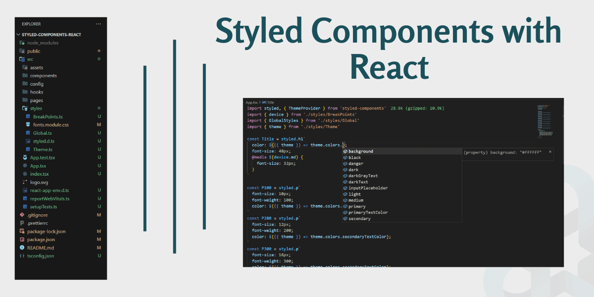
The most common and basic “best practice” for folder structuring in Reactjs or gatsbyjs projects is creating the src folder at the root in React. For styled components, we can create a styles folder inside the src folder. All styles are then kept in the styles folder. In my case, it has four main files:
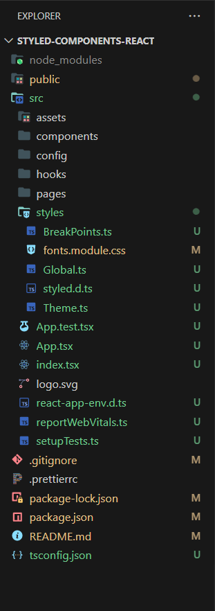
Styled Components File Structure
- Theme.ts
- Global.ts
- Breakpoints.ts
- Fonts.module.css
Let us discuss them one by one.
Note
We are using styled-components v6, which includes TypeScript types, so there's no need to install them separately.
1. Theming in Styled Components with Typescript
While working with styled-components, I noticed that theming in styled-components with TypeScript is a powerful and much easier to implement. All you need to do is to create a theme object and define all your colors, fonts, padding, margins, and other configurations there, and use theme variables wherever you need them in your app.
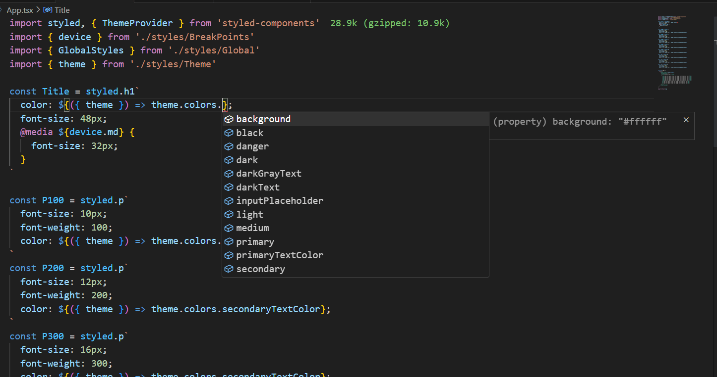
One great advantage of using TypeScript is that you can leverage its IntelliSense for theming. For that you will create a new file styled.d.ts and define your theme object there as well. For referece look at the Styled Components React GitHub Repo.
1import { DefaultTheme } from 'styled-components'
2
3export const theme: DefaultTheme = {
4  colors: {
5    primary: '#FAFAFA',
6    secondary: '#FFC80A',
7    tertiary: '#303030',
8    background: '#ffffff',
9    text: '#000000',
10    primaryTextColor: '#594F43',
11    secondaryTextColor: '#777777',
12    inputPlaceholder: '#C7C7C7',
13    darkGrayText: '#303030',
14    darkText: '#1A1A1A',
15    black: '#000000',
16    white: '#ffffff',
17    dark: '',
18    medium: '',
19    light: '',
20    danger: '',
21    success: '#66A15A',
22  },
23  fonts: {
24    anekMalayalam: 'Anek Malayalam',
25  },
26  paddings: {
27    container: '15px',
28    pageTop: '30px',
29  },
30  margins: {
31    pageTop: '30px',
32  },
33}
styled.d.ts file
1// import original module declarations
2import 'styled-components'
3
4// and extend them!
5declare module 'styled-components' {
6  export interface DefaultTheme {
7    colors: {
8      primary: '#FAFAFA'
9      secondary: '#FFC80A'
10      tertiary: '#303030'
11      background: '#ffffff'
12      text: '#000000'
13      primaryTextColor: '#594F43'
14      secondaryTextColor: '#777777'
15      inputPlaceholder: '#C7C7C7'
16      darkGrayText: '#303030'
17      darkText: '#1A1A1A'
18      black: '#000000'
19      white: '#ffffff'
20      dark: ''
21      medium: ''
22      light: ''
23      danger: ''
24      success: '#66A15A'
25    }
26    fonts: {
27      anekMalayalam: 'Anek Malayalam'
28    }
29    paddings: {
30      container: '15px'
31      pageTop: '30px'
32    }
33    margins: {
34      pageTop: '30px'
35    }
36  }
37}
Now, wherever we use theme variables, we will get IntelliSense code completion like this.
Isn't it awesome?
How to use theme in styled components
Import ThemeProvider from styled-components that takes a props theme. Now, get all the theme properties to the components wrapped inside ThemeProvider.
1import styled, { ThemeProvider } from 'styled-components'
2import { GlobalStyles } from './styles/Global'
3import { theme } from './styles/Theme'
4
5const Title = styled.h1`
6  color: ${(props) => props.theme.colors.primaryTextColor};
7`
8
9function App() {
10  return (
11    <ThemeProvider theme={theme}>
12      <GlobalStyles />
13      <Title>Hello World!</Title>
14    </ThemeProvider>
15  )
16}
17
18export default App
2. Global.ts | Global Styles in Styled Components
In global styles, we reset all the default styling.
You may have noticed I have defined font-family, color (font/text color), and background-color in body, so it impacts the whole application.
1import styled, { createGlobalStyle, css } from 'styled-components'
2import fontsCss from './fonts.module.css'
3
4export const GlobalStyles = createGlobalStyle`
5 ${fontsCss} // this works as a normal styled css
6
7/* Box sizing rules */
8*,
9*::before,
10*::after {
11  box-sizing: border-box;
12}
13
14html {
15  font-size: 100%;
16}
17
18body {
19  margin: 0;
20  padding: 0;
21  overflow-x: hidden;
22  min-height: 100vh;
23  text-rendering: optimizeSpeed;
24  font-family: ${({ theme }) => theme.fonts.anekMalayalam}, sans-serif;
25  font-size: 1rem;
26  color: ${({ theme }) => theme.colors.text};
27  background-color: ${({ theme }) => theme.colors.background};
28  line-height: 1;
29}
30h1,
31h2,
32h3,
33h4,
34h5,
35h6,
36p,
37ul,
38figure,
39blockquote,
40dl,
41dd {
42  padding: 0;
43  margin: 0;
44}
45button {
46  border: none;
47  background-color: transparent;
48  font-family: inherit;
49  padding: 0;
50  cursor: pointer;
51}
52/* Remove list styles on ul, ol elements with a list role, which suggests default styling will be removed */
53ul[role="list"],
54ol[role="list"] {
55  list-style: none;
56}
57li {
58  list-style-type: none;
59}
60/* Set core root defaults */
61html:focus-within {
62  scroll-behavior: smooth;
63}
64/* A elements that don't have a class get default styles */
65a:not([class]) {
66  text-decoration-skip-ink: auto;
67}
68
69/* Make images easier to work with */
70img,
71picture {
72  max-width: 100%;
73  display: block;
74}
75
76/* Inherit fonts for inputs and buttons */
77input,
78button,
79textarea,
80select {
81  font: inherit;
82}
83/* Remove all animations, transitions and smooth scroll for people that prefer not to see them */
84@media (prefers-reduced-motion: reduce) {
85  html:focus-within {
86    scroll-behavior: auto;
87  }
88
89  *,
90  *::before,
91  *::after {
92    animation-duration: 0.01ms !important;
93    animation-iteration-count: 1 !important;
94    transition-duration: 0.01ms !important;
95    scroll-behavior: auto !important;
96  }
97}
98`
3. Breakpoints in Styled Components
Breakpoints are the points at which the website content adjusts to the device width, allowing you to present the best possible layout to the user. In the given code, I have used max-width if you like you can change it to min-width and play with breakpoints values as per your need.
1interface Size {
2  xs: string
3  sm: string
4  md: string
5  lg: string
6  xl: string
7  xxl: string
8}
9
10const size: Size = {
11  xs: '400px', // for small screen mobile
12  sm: '600px', // for mobile screen
13  md: '900px', // for tablets
14  lg: '1280px', // for laptops
15  xl: '1440px', // for desktop / monitors
16  xxl: '1920px', // for big screens
17}
18
19export const device = {
20  xs: `(max-width: ${size.xs})`,
21  sm: `(max-width: ${size.sm})`,
22  md: `(max-width: ${size.md})`,
23  lg: `(max-width: ${size.lg})`,
24  xl: `(max-width: ${size.xl})`,
25  xxl: `(max-width: ${size.xxl})`,
26}
How to use breakpoint in media queries in styled components
To use break point in styled component we have imported the device object from BreakPoints file, and after that use the required size.
1import styled, { ThemeProvider } from 'styled-components'
2import { device } from './styles/BreakPoints'
3import { theme } from './styles/Theme'
4
5const Title = styled.h1`
6  color: ${(props) => props.theme.colors.primaryTextColor};
7  font-size: 48px;
8  @media ${device.md} {
9    font-size: 32px;
10  }
11`
12
13function App() {
14  return (
15    <ThemeProvider theme={theme}>
16      <Title>Hello world</Title>
17    </ThemeProvider>
18  )
19}
20
21export default App
I learned this technique from Mario Kandut this article
Read the article how to use media queries in styled components to learn more about media queries and breakpoints.
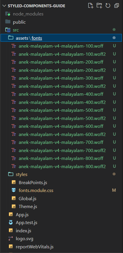
4. Using woff2 and Woff font in Styled Components
I have downloaded fonts in woff2 and woff format, the lighter and recommended font format to use, and added them to assets/fonts folder.
1/* woff2 : Super Modern Browsers */
2/* woff :Modern Browsers */
3
4@font-face {
5  font-family: 'Anek Malayalam';
6  font-style: normal;
7  font-weight: 100;
8  src:
9    url('../assets/fonts/anek-malayalam-v4-malayalam-100.woff2') format('woff2'),
10    url('../assets/fonts/anek-malayalam-v4-malayalam-100.woff') format('woff');
11  font-display: swap;
12}
13
14@font-face {
15  font-family: 'Anek Malayalam';
16  font-style: normal;
17  font-weight: 200;
18  src:
19    url('../assets/fonts/anek-malayalam-v4-malayalam-200.woff2') format('woff2'),
20    url('../assets/fonts/anek-malayalam-v4-malayalam-200.woff') format('woff');
21  font-display: swap;
22}
23
24@font-face {
25  font-family: 'Anek Malayalam';
26  font-style: normal;
27  font-weight: 300;
28  src:
29    url('../assets/fonts/anek-malayalam-v4-malayalam-300.woff2') format('woff2'),
30    url('../assets/fonts/anek-malayalam-v4-malayalam-300.woff') format('woff');
31  font-display: swap;
32}
33
34@font-face {
35  font-family: 'Anek Malayalam';
36  font-style: normal;
37  font-weight: 400;
38  src:
39    url('../assets/fonts/anek-malayalam-v4-malayalam-400.woff2') format('woff2'),
40    url('../assets/fonts/anek-malayalam-v4-malayalam-400.woff') format('woff');
41  font-display: swap;
42}
43
44@font-face {
45  font-family: 'Anek Malayalam';
46  font-style: normal;
47  font-weight: 500;
48  src:
49    url('../assets/fonts/anek-malayalam-v4-malayalam-500.woff2') format('woff2'),
50    url('../assets/fonts/anek-malayalam-v4-malayalam-500.woff') format('woff');
51  font-display: swap;
52}
53
54@font-face {
55  font-family: 'Anek Malayalam';
56  font-style: normal;
57  font-weight: 600;
58  src:
59    url('../assets/fonts/anek-malayalam-v4-malayalam-600.woff2') format('woff2'),
60    url('../assets/fonts/anek-malayalam-v4-malayalam-600.woff') format('woff');
61  font-display: swap;
62}
63
64@font-face {
65  font-family: 'Anek Malayalam';
66  font-style: normal;
67  font-weight: 700;
68  src:
69    url('../assets/fonts/anek-malayalam-v4-malayalam-700.woff2') format('woff2'),
70    url('../assets/fonts/anek-malayalam-v4-malayalam-700.woff') format('woff');
71  font-display: swap;
72}
73
74@font-face {
75  font-family: 'Anek Malayalam';
76  font-style: normal;
77  font-weight: 800;
78  src:
79    url('../assets/fonts/anek-malayalam-v4-malayalam-800.woff2') format('woff2'),
80    url('../assets/fonts/anek-malayalam-v4-malayalam-800.woff') format('woff');
81  font-display: swap;
82}
Note
JS file for fonts was reloading on every activity on the screen. We used a CSS file for fonts to fix this issue.
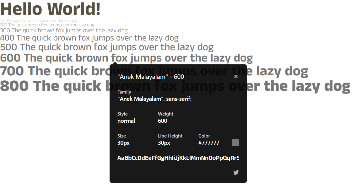
Testing Fonts in Styled Components
It’s time to test the fonts to see if we have it all set up correctly. For that, I have tested fonts from font-weight: 100 to font-weight: 800 in App.js.
Besides I used WhatFont google chrome extension to verify it.
Top UI Components Built with React and Styled Components
Here are the top 5 widely-used React components crafted using TypeScript and Styled Components:
- Navbar
- Button
- Input
- Radio Button
- Progress Steps
I will add more UI components in this React Styled Components Repo time to time. So don't forget to star it if this repo helps you in any way.😉
And that’s it, guys. We looked at folder structuring in the context of styled components, as well as the files that are part of the styles folder. Hope it added to your knowledge.
You can access these codes from this GitHub Repository
Written by
Abdul Basit
Frontend developer passionate about JavaScript, React, and building great web experiences. Writing about web development to help developers level up their skills.
Continue reading