Never write media queries hard-coded in styled components; always create variables for them.
Let me explain why…
CSS clamp and calc functions help a lot in making sites responsive without media queries. However, there are still cases when we need media queries. For example, adjusting the layout for different screen sizes, showing or hiding elements at a particular size, or adapting typography for various devices.
In previous issues of our styled components article series, we have talked about how to structure styled components in a React app, the ways to write reusable styles, and in the last article, we learned how to write reusable Flex components for faster development.
We have covered many things. Today, we are going to see how to write media queries in styled components for a production application.
Let's learn it step by step.
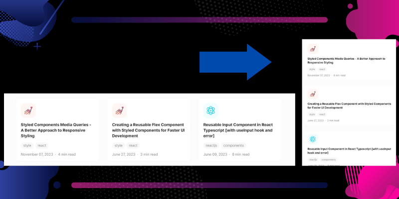
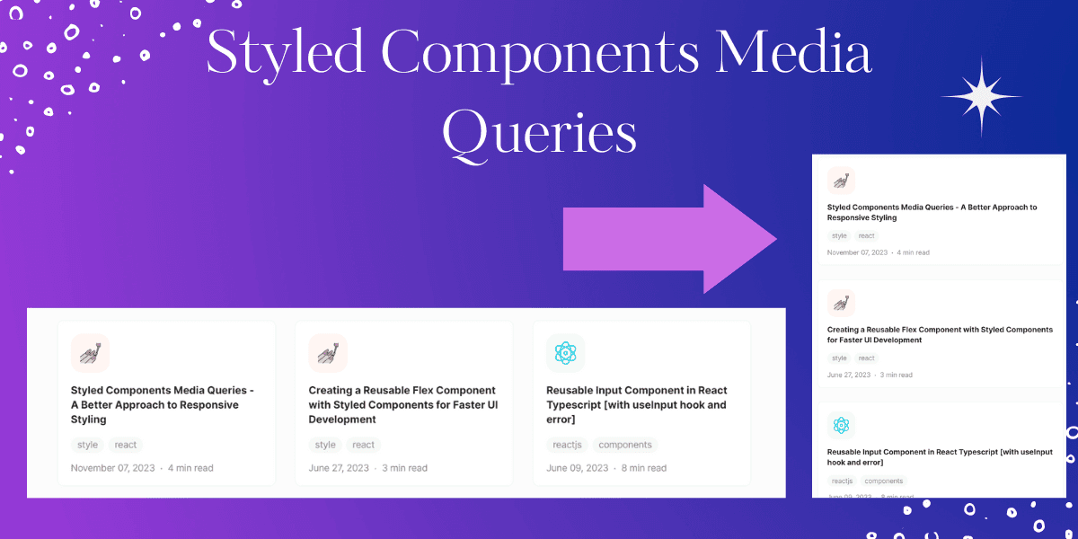
Let's start with an example. Imagine we have three cards displayed in a row, but we want them to stack in a column layout if the screen size is 600px or less.

Here's how you could write the media query without optimizing it so we can see the difference.
1const BlogCardsContainer = styled.div`
2  display: flex;
3  justify-content: space-between;
4
5  @media (max-width: 600px) {
6    flex-direction: column;
7  }
8`
This approach works well; however, there are several problems with hard-coding media queries:
- We have to remember all the breakpoints.
- If you need to make changes to the UI, such as applying smaller screen changes
(600px)to tablet screens(768px), you would have to manually locate and update every instance of the media query in the code. - The third problem is that it's not user-friendly; every time we have to repeat
@media (max-width:600px).
To address these problems, a better approach is to create a separate file called breakpoints.ts (assuming you are using TypeScript with styled components) in the styles folder for media queries. In this file, you can define all the breakpoints as an object.
1interface Size {
2  xs: string
3  sm: string
4  md: string
5  lg: string
6  xl: string
7  xxl: string
8}
9
10const size: Size = {
11  xs: '400px', // for small screen mobile
12  sm: '600px', // for mobile screen
13  md: '900px', // for tablets
14  lg: '1280px', // for laptops
15  xl: '1440px', // for desktop / monitors
16  xxl: '1920px', // for big screens
17}
18
19export const device = {
20  xs: `(max-width: ${size.xs})`,
21  sm: `(max-width: ${size.sm})`,
22  md: `(max-width: ${size.md})`,
23  lg: `(max-width: ${size.lg})`,
24  xl: `(max-width: ${size.xl})`,
25  xxl: `(max-width: ${size.xxl})`,
26}
With this setup, you can now write media queries in a more optimized way:
1const BlogCardsContainer = styled.div`
2  display: flex;
3  justify-content: space-between;
4
5  @media ${device.sm} {
6    flex-direction: column;
7  }
8`
By using the device object and accessing the appropriate property (sm in this case), we have solved the three problems mentioned earlier. It's much easier to remember and update breakpoints since they are defined in a central file, and the code becomes more readable and user-friendly.
Isn't it awesome?
Now the question is, can we further improve it?
Yes we can, the repetition of @media by optimizing it using the css function from styled-components. Here's an example of how you can achieve this:
But it personal preference, if you like this approach you can implement it.
1import { css } from 'styled-components'
2
3const device = {
4  xs: '400px',
5  sm: '600px',
6  md: '900px',
7  lg: '1280px',
8  xl: '1440px',
9  xxl: '1920px',
10}
11
12const media = {
13  xs: (...args) => css`
14    @media (max-width: ${device.xs}) {
15      ${css(...args)};
16    }
17  `,
18  sm: (...args) => css`
19    @media (max-width: ${device.sm}) {
20      ${css(...args)};
21    }
22  `,
23  md: (...args) => css`
24    @media (max-width: ${device.md}) {
25      ${css(...args)};
26    }
27  `,
28  lg: (...args) => css`
29    @media (max-width: ${device.lg}) {
30      ${css(...args)};
31    }
32  `,
33  xl: (...args) => css`
34    @media (max-width: ${device.xl}) {
35      ${css(...args)};
36    }
37  `,
38  xxl: (...args) => css`
39    @media (max-width: ${device.xxl}) {
40      ${css(...args)};
41    }
42  `,
43}
Now you can use the media object to write media queries more concisely:
1const BlogCardsContainer = styled.div`
2  display: flex;
3  justify-content: space-between;
4
5  ${media.sm`
6    flex-direction: column;
7  `}
8`
The same pattern can also be used with SCSS by making syntax modifications.
I hope you learned something useful in this article.
If you want to learn
If you want me to write an article on how I make font-size, margins and paddings responsive using CSS clamp and calc functions without writing media queries, let me know via email at basit@codevertiser.com, LinkedIn, or Twitter.
Written by
Abdul Basit
Frontend developer passionate about JavaScript, React, and building great web experiences. Writing about web development to help developers level up their skills.
Continue reading
