In this article, we are going to talk about the power of styled-components, by learning how can we reuse styles in styled components. There are many benefits of using styled components in react project, one of them is we can also write reusable styled components. Reusable styles make our project code clean, maintainable, and easier to refactor.
We will discuss two ways to reuse styles:
- Reusable Styled Components
- Reusable utility classes
1. Reusable Styled Components
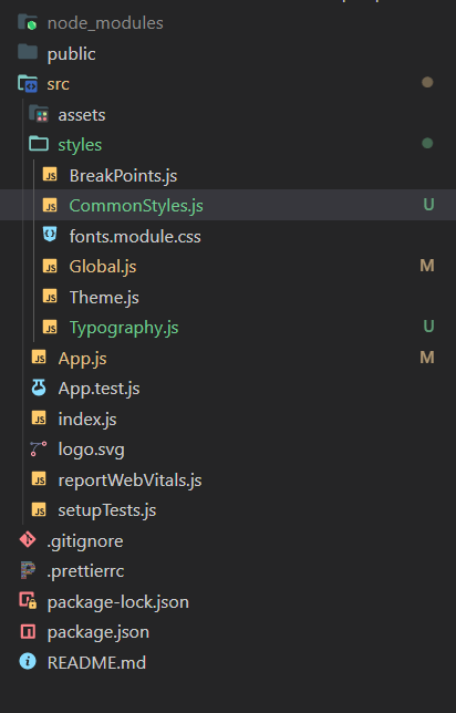
In this section, we are going to discuss and write popular and most commonly used styled components that you can use in your project as well. We usually put these components in some common place of the project instead of some specific files. I prefer writing reusable components in Global.js file.
i. Container in Styled Components
The container component of styled components is similar to the container in bootstrap, material UI, and other CSS frameworks. That is used for containing or wrapping things in a specific area.
1export const Container = styled.div`
2  width: 100%;
3  max-width: 1360px;
4  margin: 0 auto;
5  padding: 0 ${({ theme }) => theme.paddings.container};
6  ${({ medium }) =>
7    medium &&
8    css`
9      max-width: 1200px;
10    `}
11  ${({ small }) =>
12    small &&
13    css`
14      max-width: 1100px;
15    `}
16`
ii. Grid Component in styled components
Responsiveness is an important aspect of all modern web projects, it allows our site to be flexible for viewing on multiple types of devices. We can use either grid or flex to make our site responsive.
The Grid component can be implemented by just wrapping its children inside and passing the props. If you like you can customize this component as per your need.
1export const Grid = styled.div`
2  display: grid;
3  grid-template-columns: repeat(${({ columns }) => columns || 2}, 1fr);
4  justify-items: ${({ end }) => end && 'end'};
5  grid-column-gap: calc(${({ cgp }) => cgp} * 1px);
6  ${({ pt }) =>
7    pt &&
8    css`
9      padding-top: calc(${pt} * 1px);
10    `}
11  ${({ pb }) =>
12    pb &&
13    css`
14      padding-bottom: calc(${pb} * 1px);
15    `}
16  ${({ fullHeight }) =>
17    fullHeight &&
18    css`
19      height: 100%;
20    `}
21  ${({ py }) =>
22    py &&
23    css`
24      padding-top: calc(${py}* 1px);
25      padding-bottom: calc(${py}* 1px);
26    `}
27`
iii. Box Component in Styled Components
The Box component makes development faster. It is used to give margin or padding to some independent component or jsx. Let's say we have a Button component, and we have to add margin around it and align it on the screen as well. Normally, we would put it in a div and then position that div.
The Box Component in React replaces this process by letting us wrap the Button component inside the box, and passing the related props.
1export const Box = styled.div`
2  margin-top: calc(${({ mt }) => mt} * 1px);
3  ${({ flxRight }) =>
4    flxRight &&
5    css`
6      display: flex;
7      justify-content: flex-end;
8    `}
9  ${({ smNone }) =>
10    smNone &&
11    css`
12      ${SmallDevicesHidden}
13    `}
14`
2. Utility Classes in Styled Components
Utility classes are not like components, instead, they behave like the mixins that we have in SCSS.
Here, we import CSS from styled-components, and then call utility classes inside styled components. This smoothens the development process by reducing a couple of lines of code as well as development time, you can make as many classes as you want.
i. Horizontally and vertically center an element using flexbox
1export const FlxCenter = css`
2  display: flex;
3  justify-content: center;
4  align-items: center;
5`
How to use Utility Classes
This is how we can use the above FlxCenter utility class inside a styled components.
1import styled from 'styled-components'
2import { device } from 'styles/BreakPoints'
3import { FlxCenter } from 'styles/Global'
4
5const CardStyle = styled.nav`
6  display: flex;
7  justify-content: space-between;
8  @media ${device.md} {
9    ${FlxCenter}
10  }
11`
ii. For absolute center
1export const AbsCenter = css`
2  top: 50%;
3  left: 50%;
4  transform: translate(-50%, -50%);
5`
iii. Hide for small devices
1export const SmallDeviceShow = css`
2  @media screen and (min-width: 600px) {
3    display: none;
4  }
5`
And that is it for styled components. Feel free to use these codes in your projects, you can access them from the GitHub Repository.
Do share this post if it helped you learn something new. You’ll also find more posts related to React and Javascript on the home page.
Written by
Abdul Basit
Frontend developer passionate about JavaScript, React, and building great web experiences. Writing about web development to help developers level up their skills.
Continue reading