Sometimes we are given a design of a Radio button that is different from the default one. So we have to build a custom radio button to mimic the design.
A key component of forms in any website is a radio button. We use them when a user is required to choose just one option from a list. The game changes when you customize the default Radio Button in ReactJS and give it personal look.
You’ll master the fundamentals and how to create a unique radio button in reactjs in this article.
Before starting, let me show you how our ultimate result will look.
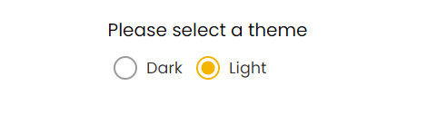
Custom Radio Button React Codepen
If you just want the code, it's right there in the Codepen widget. But if you prefer to understand how it's made, check out the article for a step-by-step guide.
Difference between Radio button and Checkbox
Before starting I would like to describe where to use the radio buttons and where to use the checkboxes so a beginner should not get confused.
A radio button is used for selecting only one option from a list while a checkbox is used for selecting multiple options.
Radio button is perfect for choices like gender and civil status since a user can only have one.
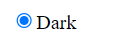
Default Radio Button UI
We all know creating a default Radio button in react js is pretty easy.
1function RadioButton() {
2  const onChange = (e) => {
3    const { name } = e.target
4    console.log('clicked', name)
5  }
6
7  return (
8    <label htmlFor="dark">
9      <input type="radio" name="dark" id="dark" value="dark" onChange={onChange} checked={true} />
10      Dark
11    </label>
12  )
13}
This is how the default radio button UI looks like in Reactjs.
Custom Radion Button in Reactjs
For custom radio button we will be using a trick, the trick will be quite simple and straightforward.
Since we have limited options available and can not play much with the default Radio button CSS (UI) so we are going to hide it using CSS.
1const RadioButton = () => {
2  const onChange = (e) => {
3    const { name } = e.target
4    console.log('clicked  ==>', name)
5  }
6
7  return (
8    <label htmlFor="dark" className="radio-label">
9      <input
10        className="radio-input"
11        type="radio"
12        name="dark"
13        id="dark"
14        value="dark"
15        onChange={onChange}
16        checked={false}
17      />
18      Dark
19    </label>
20  )
21}
Here we have added a radio-input class and styled it using CSS.
Hiding the Default Radio Button CSS Properties
1.radio-label {
2}
3
4.radio-input {
5  visibility: hidden;
6}
Key Point
You may notice we made visibility: hidden property but not display: none.
Do you have any idea why?
Because in case of display none, the element doesn't exist in DOM and we can not use any of input:radio prop, while visibility hidden just hides the UI, we can still use it props.
In short, we are interested in its props and onChange function but not the UI.
Adding a Radio button onChange function
1const onChange = (e) => {
2 const { name } = e.target
3 console.log('clicked ==>', name)
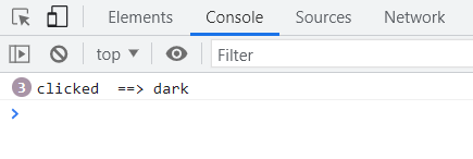
4}Since radio button is an input element so its onChange function works the same way it works for other input types like text, email, password, etc. We have passed a name prop in input tag, so we can get a name of the selected (targeted) input and take action accordingly.
The radio circle is hidden, but if we inspect the browser and click the label we can see the console dark, it means our onChange function is working and we are receiving the name of the targeted element..
Remember
If radio button checked is true means it is already selected then onChange function will not work.
To create a custom radio circle, we added an empty span inside our radio button component. We will style this span like radio or custom design we are given as you have seen above. You understood my point. Right?
1const RadioButton = ({ name, id, value, onChange, checked, text }) => {
2  return (
3    <label htmlFor={id} className="radio-label">
4      <input
5        className="radio-input"
6        type="radio"
7        name={name}
8        id={id}
9        value={value}
10        onChange={onChange}
11        checked={checked}
12      />
13      <span className="custom-radio" />
14      {text}
15    </label>
16  )
17}
In this step, we have also made Radio Button component reusable via props.
We are almost done with jsx part but before we switch to CSS let me explain why we added an id attribute to the label and input tag and what are the advantages of it.
Why use the id in Radio Button?
Adding an id is beneficial for user experience (UX). With an id, we can select by clicking on the text or even a radio circle. If we don’t add an id, the only way to choose the option is by clicking the radio button, not the circle text (label).
Styling Custom Radio Button
Understanding the CSS for custom radio button component in React is essential.
We have already talked about why we made visibility hidden of radio input component.
Now we need to talk about two more style optimization:
- Styling Radio circle
- Styling Radio circle when it is selected
1. Styling Radio Circle
We’ll start by discussing the style of custom radio circle we made.
As we have added span tag with the class of custom-radio to style it.
1.custom-radio {
2  left: -8px;
3  top: 6px;
4  cursor: pointer;
5  width: 17px;
6  height: 17px;
7  border: 2px solid #9a9a9a;
8  border-radius: 50%;
9  display: inline-block;
10  position: relative;
11}
12
13/* for inner filled circle */
14.custom-radio::after {
15  content: '';
16  width: 12px;
17  height: 12px;
18  background: #f4b400;
19  position: absolute;
20  border-radius: 50%;
21  top: 50%;
22  left: 50%;
23  transform: translate(-50%, -50%);
24  opacity: 0;
25  transition: opacity 0.2s;
26}
2. Styling Radio Circle When It Is Selected
The last but not least concept is here, in this style we are saying, when radio button is checked(selected), add a border in radio input UI border: 2px solid #f4b400; and make the opacity of custom-radio class from 0 to 1.
We select the custom-radio::after pseudo-class using CSS adjacent selector.
Here you can read more about how to select CSS adjacent classes and other CSS sectors.
1.radio-input {
2  visibility: hidden;
3}
4
5.radio-input:checked + span {
6  border: 2px solid #f4b400;
7}
8
9.radio-input:checked + span:after {
10  opacity: 1;
11}
We are done with the component code and its style, let's test the component.
Let's say we are giving an option to user to select a theme either light or dark, for that we are using the radio button component we just made. This can be used for any purpose, like selecting gender, marital status, etc.
1const App = () => {
2  const [theme, setTheme] = useState({ dark: false, light: false })
3
4  const onChangeTheme = (e) => {
5    const { name } = e.target
6    console.log('clicked', name)
7    if (name === 'light') {
8      setTheme({ dark: false, light: true })
9    }
10    if (name === 'dark') {
11      setTheme({ dark: true, light: false })
12    }
13  }
14
15  return (
16    <div className="select-theme">
17      <p>Please select a theme</p>
18      <RadioButton
19        name="dark"
20        id="dark"
21        value="Dark"
22        text="Dark"
23        onChange={onChangeTheme}
24        checked={theme.dark}
25      />
26      <RadioButton
27        name="light"
28        id="light"
29        value="Light"
30        text="Light"
31        onChange={onChangeTheme}
32        checked={theme.light}
33      />
34    </div>
35  )
36}
First of all, we defined a state for options we want the user to select.
By default both options are unchecked or unselected, then on basis of user selection, we are changing the state and making that clicked option true using below function. You can change this function as per your need.
1const onChangeTheme = (e) => {
2  const { name } = e.target
3
4  if (name === 'light') {
5    setTheme({ dark: false, light: true })
6  }
7  if (name === 'dark') {
8    setTheme({ dark: true, light: false })
9  }
10}
Custom Radio Button Reactjs Complete Component
1import React from 'react'
2import './index.css'
3
4const RadioButton = ({ name, id, value, onChange, checked, text }) => {
5  return (
6    <label htmlFor={id} className="radio-label">
7      <input
8        className="radio-input"
9        type="radio"
10        name={name}
11        id={id}
12        value={value}
13        onChange={onChange}
14        checked={checked}
15      />
16      <span className="custom-radio" />
17      {text}
18    </label>
19  )
20}
21
22export default RadioButton
Radio Button CSS Code
1@import url('https://fonts.googleapis.com/css2?family=Poppins:wght@300;400;500&display=swap');
2
3body {
4  font-family: 'Poppins', sans-serif;
5  margin: 0;
6  padding: 0;
7  box-sizing: border-box;
8  display: flex;
9  justify-content: center;
10}
11
12.select-theme {
13  margin-top: 20px;
14}
15
16.select-theme p {
17  margin: 0 0 5px 0;
18  padding: 0;
19}
20
21.radio-label {
22  color: #303030;
23  font-size: 14px;
24  font-weight: 400;
25  margin-right: 7px;
26  -webkit-tap-highlight-color: transparent;
27  cursor: pointer;
28}
29
30.radio-input {
31  margin: 0;
32  visibility: hidden;
33}
34
35.radio-input:checked + span {
36  border: 2px solid #f4b400;
37}
38
39.radio-input:checked + span:after {
40  opacity: 1;
41}
42
43.custom-radio {
44  left: -8px;
45  top: 6px;
46  cursor: pointer;
47  width: 17px;
48  height: 17px;
49  border: 2px solid #9a9a9a;
50  border-radius: 50%;
51  display: inline-block;
52  position: relative;
53}
54
55/* for inner filled circle */
56.custom-radio::after {
57  content: '';
58  width: 12px;
59  height: 12px;
60  background: #f4b400;
61  position: absolute;
62  border-radius: 50%;
63  top: 50%;
64  left: 50%;
65  transform: translate(-50%, -50%);
66  opacity: 0;
67  transition: opacity 0.2s;
68}
Read More On This
Since a Radio Button is a part of a form element, it's good to know about ReactJS form best practices.
A form remains incomplete without an input element, so learn how to build a reusable input component in ReactJS with error.
Wait,
To submit the form, a Submit Button is needed. Read about how to build a loading spinner in ReactJS.
Summing Up
Radio Buttons are great when you want users to select one option. We have tried to explain how to create custom radio buttons, how to use onChange function, and basic hidden visibility technique. Don’t forget to implement it and use it in your own style.
Written by
Abdul Basit
Frontend developer passionate about JavaScript, React, and building great web experiences. Writing about web development to help developers level up their skills.
Continue reading