
As a senior react developer in several organizations, I have worked on almost all the CSS frameworks in react projects, from reactstrap to Material UI, SCSS, plain CSS, and styled components. I enjoyed implementing and using styled components.
Once you have started using Styled Components with React, you won’t like to go back to SCSS or other CSS frameworks.
Are you amazed why I love styled components so much?
The benefits of styled components make them worth it. Some of them are:
- Hassle-free theme development and maintenance.
- No more unmanageable code.
- Implement conditional and dynamic styling effortlessly.
- No worries about unique class names
1. Simplify Theme Development and Management with Styled Components
One of the standout advantages of using Styled Components is its ability to create hassle-free themes for your application. With Styled Components, you can easily define a JavaScript object to represent your theme, pass it as props to the ThemeProvider provided by Styled Components, and access it throughout your app.
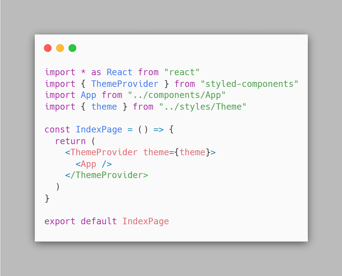
Styled Components make theme management simple and intuitive. If you want to learn more about themes and folder structure best practices, check out Styled Components Folder Structure Article article.
2. Enhance Component Cleanliness with .attrs Attribute
Styled Components provide the .attrs attribute, which allows you to define props directly in the style declaration. This feature helps keep your React components' JSX clean and manageable.
Example
Consider the following example of a button styled component that utilizes the .attrs method to add a color prop:
1import styled from 'styled-components'
2
3const StyledButton = styled.button.attrs(() => ({
4 color: 'primary',
5}))`
6 background: ${({ color }) => (color === 'primary' ? '#f5b40d' : '#138496')};
7 border: none;
8 outline: none;
9 border-radius: 8px;
10 font-weight: 700;
11 font-size: 14px;
12 color: #ffffff;
13 min-width: 200px;
14 min-height: 36px;
15 cursor: pointer;
16 outline: none;
17`
18
19const Button = () => {
20 return <StyledButton>Submit</StyledButton>
21}
22
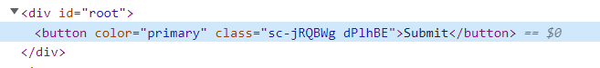
23export default ButtonIn Button jsx, you will not see the color props, but we have added them via the styled component. You can also add color props dynamically.
Let me prove you by showing a DOM image.
Here you can read a detailed article about .attrs method and how to use them.
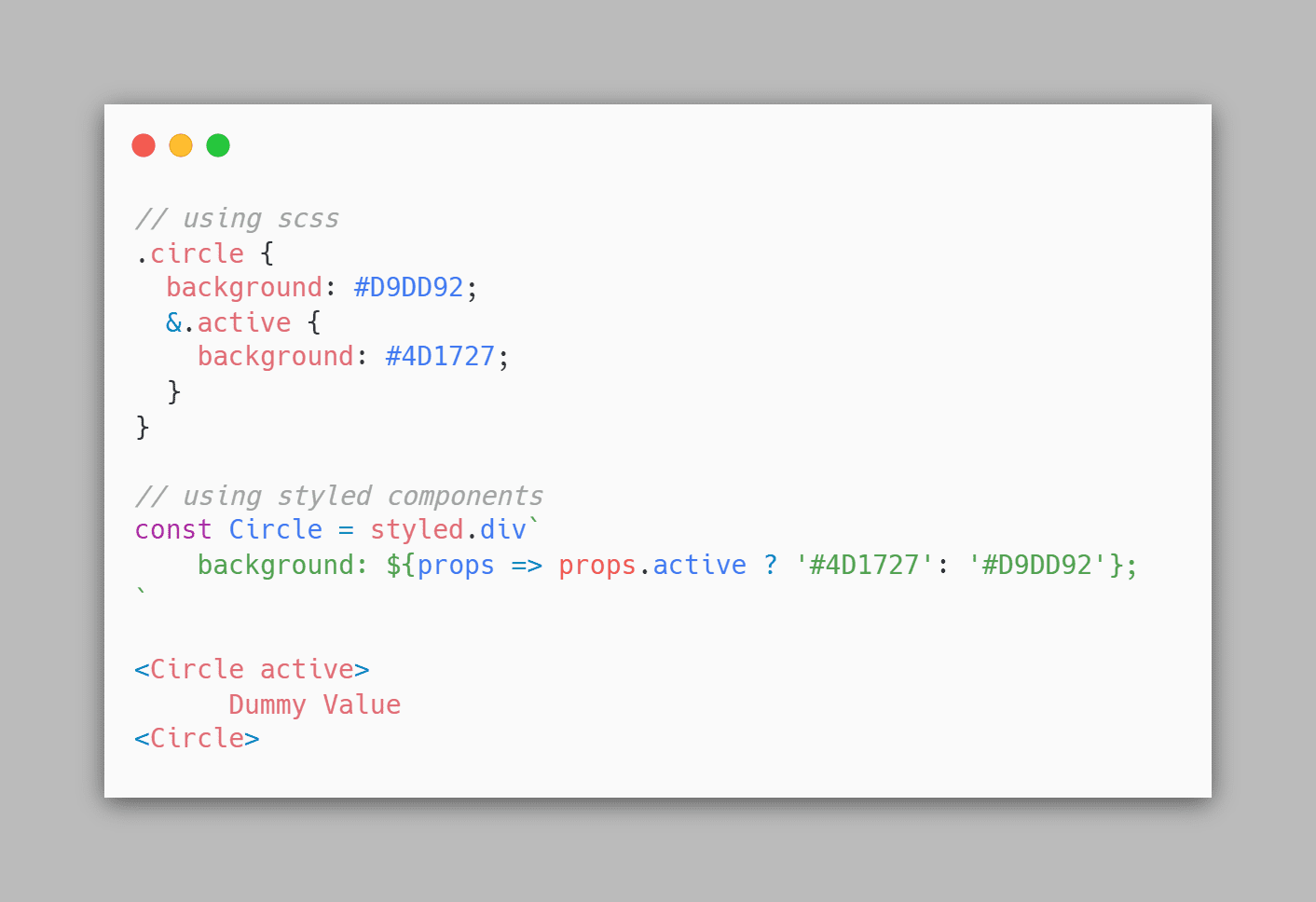
3. Achieve Conditional and Dynamic Styling with Ease
As we know we can pass props in styled components this is where the power comes in. In below example, we are discussing how we can write dynamic styles on the basis of props.
In SCSS, to make our code look clean we achieve this functionality using an extra package classnames.
To learn more about reusing styled components and implementing conditional and dynamic styling with examples, check out the article where we have talked about how to reuse styled components with examples.
4. Don't have to worry about Unique class names and overlapping styles
Unlike other CSS frameworks, I don’t have to worry about giving a unique class name to a parent element, overlap styling, and misspellings, styled components handle it for me behind the scene.
1import styled, { ThemeProvider } from 'styled-components'
2import { device } from './styles/BreakPoints'
3import { GlobalStyles } from './styles/Global'
4import { theme } from './styles/Theme'
5
6const Title = styled.h1`
7 color: ${(props) => props.theme.colors.primaryTextColor};
8 font-size: 48px;
9 @media ${device.md} {
10 font-size: 32px;
11 }
12`
13const P100 = styled.h1`
14 font-size: 10px;
15 font-weight: 100;
16 color: ${({ theme }) => theme.colors.secondaryTextColor};
17`
18const H2 = styled.h2`
19 font-size: 36px;
20 font-weight: 700;
21 color: ${({ theme }) => theme.colors.secondaryTextColor};
22`
23
24function App() {
25 return (
26 <ThemeProvider theme={theme}>
27 <GlobalStyles />
28 <Title>Hello World!</Title>
29 <>
30 <P100>100 The quick brown fox jumps over the lazy dog</P100>
31 <H2>700 The quick brown fox jumps over the lazy dog</H2>
32 </>
33 </ThemeProvider>
34 )
35}
36
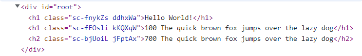
37export default AppIn this DOM image you can see styled components assign a unique class name to each element or each style.
Conclusion
Styled components have much more to discover. They are reusable, manageable, clean, and much more. Start experimenting with it, and you will know the other benefits of styled components. You can also begin with my blogs. Don’t wait, get into it, and Happy Learning!
Written by
Abdul Basit
Frontend developer passionate about JavaScript, React, and building great web experiences. Writing about web development to help developers level up their skills.
Continue reading