
We are back with another quick tutorial related to styled-components. In this, you will learn how to use locally downloaded images with styled-components. To use these images, we will use the img tag with the .attrs method of styled-components.
So, before diving into the coding part, let us first understand the styled-component .attrs method.
Why and when to use styled-components .attrs method
As per styled components docs
“It is a chainable method that attaches some props to a styled component. The first and only argument is an object that will be merged into the rest of the component's props.”
Simply, attrs() in styled-components serves the following purposes:
- To make your styled components' default HTML attributes so you won't need to give the prop
- To change the default HTML property by passing props to a component that dynamically styles itself.
Example to understand styled-components .attrs method
For clear understanding, first, we have downloaded an image from Unsplash and passed it into the src attribute of the img tag. Later, we will change the code into styled components.
Code with the src and alt attribute
1import DevDesk from './assets/images/dev-desk.jpg'
2
3const App = () => {
4  return (
5    <div>
6      <img src={DevDesk} alt="Article Cover" />
7    </div>
8  )
9}
10
11export default App
Code with a simple styled component in react
The logic of the code is the same, but we have converted the simple react component to a styled component.
1import styled from 'styled-components'
2import DevDesk from './assets/images/dev-desk.jpg'
3
4const CoverImg = styled.img`
5  width: 500px;
6`
7
8const App = () => {
9  return (
10    <div>
11      <CoverImg src={DevDesk} alt="Article Cover" />
12    </div>
13  )
14}
15
16export default App
Code using .attrs Method
1import styled from 'styled-components'
2import DevDesk from './assets/images/dev-desk.jpg'
3
4const CoverImg = styled.img.attrs((props) => ({
5  src: props.src,
6}))`
7  width: 500px;
8`
9
10const App = () => {
11  return (
12    <>
13      <CoverImg src={DevDesk} alt="article cover" />
14    </>
15  )
16}
17
18export default App
Comprehending the difference between codes
All the above codes have the same results. You might have questions like:
- Why are we changing the code when the results are similar?
- Why have we added the src props using the .attrs method to the code?
The answer is to make the code clean, manageable, and organized. Now we are going to add the alt attribute to the img tag using the .attrs attribute.
1import styled from 'styled-components'
2import DevDesk from './assets/images/dev-desk.jpg'
3
4const CoverImg = styled.img.attrs(({ src }) => ({
5  src: src,
6  alt: 'Article Cover',
7}))`
8  width: 500px;
9`
10
11const App = () => {
12  return (
13    <>
14      <CoverImg src={DevDesk} />
15    </>
16  )
17}
18
19export default App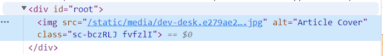
If we inspect the DOM, we can see that the image tag has an alt attribute. Isn't it incredible? In addition to img tags, we can use the .attrs attribute everywhere else we need to add props.
Was it helpful for you? If yes, do share it within your community. Happy learning!
Written by
Abdul Basit
Frontend developer passionate about JavaScript, React, and building great web experiences. Writing about web development to help developers level up their skills.
Continue reading