Whenever we go to a web app, the navbar catches our attention first. So, creating a responsive navbar is important. In today's article, you will learn how to create a responsive Navbar in ReactJS. It will look perfect in all screen sizes, from larger desktops to 400px mobile screens. You can use this Navbar component in your landing pages, portfolios, and Dashboard, just by doing little customization.
We will talk about the mobile design once we will be done with the desktop version.
If you are only interested in code you can find it here on codepen;
Codepen Demo | ReactJS Responsive Navbar
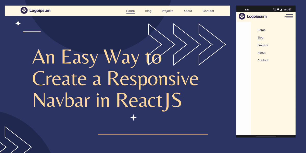
ReactJS Navbar for Desktop
The navbar will look like this on Desktop screens.

You have to create the basic Navbar component first. Here, the main nav tag will have two div, one for the logo and another for nav items or nav links.
1import { ReactComponent as Brand } from '../../assets/icons/logo.svg'
2
3const Navbar = () => {
4  return (
5    <nav>
6      <div>
7        <Brand />
8      </div>
9      <div>
10        <ul>
11          <li>Home</li>
12          <li>Blog</li>
13          <li>Projects</li>
14          <li>About</li>
15          <li>Contact</li>
16        </ul>
17      </div>
18    </nav>
19  )
20}
21
22export default Navbar
Reference
For the logo, I am using a mock logo from https://logoipsum.com/. You can use your logo.
Once we are done with base structure, we want our navbar links to navigate to specific routes, for that we need to wrap it inside anchor a tag.
1import { ReactComponent as Brand } from '../../assets/icons/logo.svg'
2
3const Navbar = () => {
4  return (
5    <nav>
6      <div>
7        <Brand />
8      </div>
9      <div>
10        <ul>
11          <li>
12            <a href="/">Home</a>
13          </li>
14          <li>
15            <a href="/blog">Blog</a>
16          </li>
17          <li>
18            <a href="/projects">Projects</a>
19          </li>
20          <li>
21            <a href="/about">About</a>
22          </li>
23          <li>
24            <a href="/contact">Contact</a>
25          </li>
26        </ul>
27      </div>
28    </nav>
29  )
30}
31
32export default Navbar
It looks fine. Right? No, It has a problem.
Problem
The whole page refreshes when we navigate to the given path or one page to another. It should work like a single-page app with smooth navigation.
Download React Router Dom
The solution to the problem is the Navlink component. It is used for internal linking in React. For this, we need to download react router dom Package in React application.
npm install react-router-dom@6
After downloading the package, import NavLink from react router dom and wrap nav item into NavLink instead of HTML anchor tag.
1import { NavLink } from 'react-router-dom'
2import { ReactComponent as Brand } from '../../assets/icons/logo.svg'
3import './navbar.css'
4
5const Navbar = () => {
6  return (
7    <nav className="navbar">
8      <div className="container">
9        <div className="logo">
10          <Brand />
11        </div>
12        <div className="nav-elements">
13          <ul>
14            <li>
15              <NavLink to="/">Home</NavLink>
16            </li>
17            <li>
18              <NavLink to="/blog">Blog</NavLink>
19            </li>
20            <li>
21              <NavLink to="/projects">Projects</NavLink>
22            </li>
23            <li>
24              <NavLink to="/about">About</NavLink>
25            </li>
26            <li>
27              <NavLink to="/contact">Contact</NavLink>
28            </li>
29          </ul>
30        </div>
31      </div>
32    </nav>
33  )
34}
35
36export default Navbar
With the navlink, you also have to import BrowserRouter and wrap the App component in it.
1import { BrowserRouter } from 'react-router-dom'
2import Navbar from './components/Navbar'
3
4const App = () => {
5  return (
6    <BrowserRouter>
7      <Navbar />
8    </BrowserRouter>
9  )
10}
11
12export default App
React navbar highlights active page
What if you want to highlight the active page to know on which page are you?
What does React Router NavLink Do?
If we will inspect the DOM we will notice we still have an anchor tag but with some additional attributes or props. As soon we hit the link class="active" and aria-current="page" attributes applied to anchor tag.
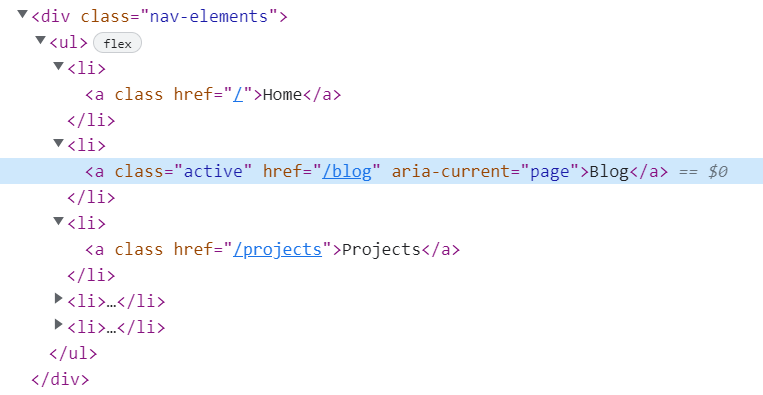
As we know when we click the link it got active class. We can easily style the active class using CSS, so it looks bit different than other nav links.
Navbar Desktop UI CSS
1@import url('https://fonts.googleapis.com/css2?family=Poppins:wght@400;500;600;700&display=swap');
2
3body {
4  margin: 0;
5  padding: 0;
6  font-family: 'Poppins', sans-serif;
7  background-color: #fcfcfc;
8}
9
10.container {
11  max-width: 1100px;
12  margin: 0 auto;
13  padding: 0 15px;
14  display: flex;
15  justify-content: space-between;
16  align-items: center;
17  height: 100%;
18}
19
20.navbar {
21  height: 60px;
22  background-color: #fef7e5;
23  position: relative;
24}
25
26.logo {
27}
28
29.nav-elements {
30}
31
32.nav-elements ul {
33  display: flex;
34  justify-content: space-between;
35  list-style-type: none;
36}
37
38.nav-elements ul li:not(:last-child) {
39  margin-right: 60px;
40}
41
42.nav-elements ul a {
43  font-size: 16px;
44  font-weight: 400;
45  color: #2f234f;
46  text-decoration: none;
47}
48
49.nav-elements ul a.active {
50  color: #574c4c;
51  font-weight: 500;
52  position: relative;
53}
54
55.nav-elements ul a.active::after {
56  content: '';
57  position: absolute;
58  bottom: -4px;
59  left: 0;
60  width: 100%;
61  height: 2px;
62  background-color: #574c4c;
63}
What do you think, doesn’t NavLink have made our life easier?
Pro Responsive Tip
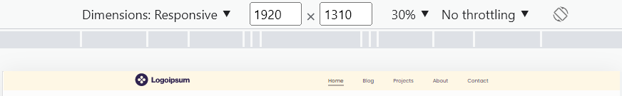
Look into the code that there is a div with a class container inside the nav tag. container class have max-width: 1100px , so navbar elements should not exceed 1100px when screen resizes.
Here I have tested in 1920 viewport.
Congratulations, your desktop navbar design is ready.
Making Navbar Responsive
You can make the Navbar responsive in two ways. The first one uses CSS and another uses React.
- Using CSS: In CSS, you can simply change the display to none or block at your desired width to just completely change the HTML style.
- Using React: In React, you can use a
useMediaQueryhook. You can learn more about React Custom hooks here.
You might be thinking what’s the difference and which one to use?
When we use CSS display: none property, the HTML remains in the DOM. On the other hand, the useMediaQuery hook does not have HTML in DOM. Remove JSX at a certain point from DOM to reduce its size.
Since this Navbar is not complex, so you can use CSS. It will make the code cleaner and easy to understand.
Mobile Screen Navbar Design
Your Navbar should look like this on the Mobile.
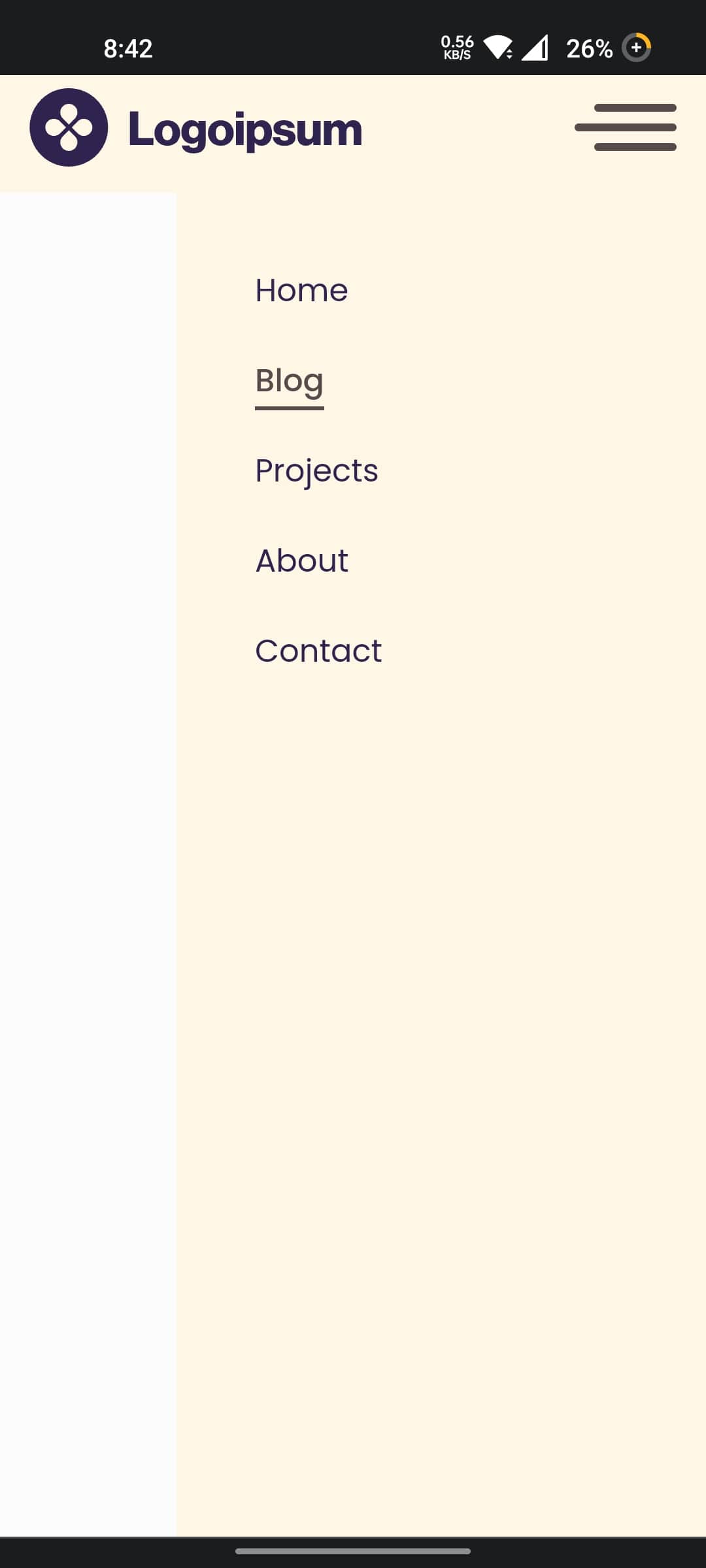
The logo will be in its place, but instead of nav items (nav links), we will have hamburger icon, by pressing hamburger icon, nav links will slide from the right side of the screen.
For toggling nav elements we need to have a state and toggle function. The only state and function we need for this component.
1const [showNav, setShowNav] = useSate(false)
2
3const toggleNavItems = () => {
4  setShowNav(!showNav)
5}
As we know by clicking the hamburger icon nav elements will slide from the right side of the screen.
So at 600px we are changing .nav-elements class styles.
1.nav-elements {
2  position: absolute;
3  right: 0;
4  top: 60px;
5  background-color: #fef7e5;
6  width: 0;
7  height: calc(100vh - 60px);
8  transition: all 0.3s ease-in;
9  overflow: hidden;
10}
You can look into the code that the position of .nav-elements is absolute. We also have to adjust it on the right of the screen. The width is 0 as the active class will make the width 270px. You can adjust the size as per your requirements.
Moving to the Sidebar animation Now!
When we invoke the toggleNavItems function on the hamburger, set showNav to true. When the showNav is true, show the sidebar containing the nav links. You can do it by adding the .active class to it.
1const Navbar = () => {
2  const [showNavbar, setShowNavbar] = useState(false)
3
4  const handleShowNavbar = () => {
5    setShowNavbar(!showNavbar)
6  }
7
8  return (
9    <nav className="navbar">
10      <div className="container">
11        <div className="logo">
12          <Brand />
13        </div>
14        <div className="menu-icon" onClick={handleShowNavbar}>
15          <Hamburger />
16        </div>
17        <div className={`nav-elements ${showNavbar && 'active'}`}>
18          <ul>...</ul>
19        </div>
20      </div>
21    </nav>
22  )
23}
24
25export default Navbar
Style for Mobile Screen Navbar
1@media (max-width: 600px) {
2  .menu-icon {
3    display: block;
4    cursor: pointer;
5  }
6
7  .nav-elements {
8    position: absolute;
9    right: 0;
10    top: 60px;
11    background-color: #fef7e5;
12    width: 0px;
13    height: calc(100vh - 60px);
14    transition: all 0.3s ease-in;
15    overflow: hidden;
16  }
17
18  .nav-elements.active {
19    width: 270px;
20  }
21
22  .nav-elements ul {
23    display: flex;
24    flex-direction: column;
25  }
26
27  .nav-elements ul li {
28    margin-right: unset;
29    margin-top: 22px;
30  }
31}
Before going ahead, we should understand two points. As you can see, the viewport is 600px.
- Initially
.menu-iconwasdisplay: noneso we made itdisplay: blockto make it visible - We have also added
.activeclass that makes sidebarwidth: 270px
React Responsive Navbar Complete Component
1import { useState } from 'react'
2import { NavLink } from 'react-router-dom'
3import { ReactComponent as Hamburger } from '../../assets/icons/hamburger.svg'
4import { ReactComponent as Brand } from '../../assets/icons/logo.svg'
5import './navbar.css'
6
7const Navbar = () => {
8  const [showNavbar, setShowNavbar] = useState(false)
9
10  const handleShowNavbar = () => {
11    setShowNavbar(!showNavbar)
12  }
13
14  return (
15    <nav className="navbar">
16      <div className="container">
17        <div className="logo">
18          <Brand />
19        </div>
20        <div className="menu-icon" onClick={handleShowNavbar}>
21          <Hamburger />
22        </div>
23        <div className={`nav-elements ${showNavbar && 'active'}`}>
24          <ul>
25            <li>
26              <NavLink to="/">Home</NavLink>
27            </li>
28            <li>
29              <NavLink to="/blog">Blog</NavLink>
30            </li>
31            <li>
32              <NavLink to="/projects">Projects</NavLink>
33            </li>
34            <li>
35              <NavLink to="/about">About</NavLink>
36            </li>
37            <li>
38              <NavLink to="/contact">Contact</NavLink>
39            </li>
40          </ul>
41        </div>
42      </div>
43    </nav>
44  )
45}
46
47export default Navbar
CSS for Responsive Navbar
1@import url('https://fonts.googleapis.com/css2?family=Poppins:wght@400;500;600;700&display=swap');
2
3body {
4  margin: 0;
5  padding: 0;
6  font-family: 'Poppins', sans-serif;
7  background-color: #fcfcfc;
8}
9
10.container {
11  max-width: 1100px;
12  margin: 0 auto;
13  padding: 0 15px;
14  display: flex;
15  justify-content: space-between;
16  align-items: center;
17  height: 100%;
18}
19
20.navbar {
21  height: 60px;
22  background-color: #fef7e5;
23  position: relative;
24}
25
26.logo {
27}
28
29.menu-icon {
30  display: none;
31}
32
33.nav-elements {
34}
35
36.nav-elements ul {
37  display: flex;
38  justify-content: space-between;
39  list-style-type: none;
40}
41
42.nav-elements ul li:not(:last-child) {
43  margin-right: 60px;
44}
45
46.nav-elements ul a {
47  font-size: 16px;
48  font-weight: 400;
49  color: #2f234f;
50  text-decoration: none;
51}
52
53.nav-elements ul a.active {
54  color: #574c4c;
55  font-weight: 500;
56  position: relative;
57}
58
59.nav-elements ul a.active::after {
60  content: '';
61  position: absolute;
62  bottom: -4px;
63  left: 0;
64  width: 100%;
65  height: 2px;
66  background-color: #574c4c;
67}
68
69@media (max-width: 768px) {
70  .nav-elements ul li:not(:last-child) {
71    margin-right: 30px;
72  }
73}
74
75@media (max-width: 600px) {
76  .menu-icon {
77    display: block;
78    cursor: pointer;
79  }
80
81  .nav-elements {
82    position: absolute;
83    right: 0;
84    top: 60px;
85    background-color: #fef7e5;
86    width: 0px;
87    height: calc(100vh - 60px);
88    transition: all 0.3s ease-in;
89    overflow: hidden;
90  }
91
92  .nav-elements.active {
93    width: 270px;
94  }
95
96  .nav-elements ul {
97    display: flex;
98    flex-direction: column;
99  }
100
101  .nav-elements ul li {
102    margin-right: unset;
103    margin-top: 22px;
104  }
105}
Further Read
If you're looking for multiple variations of a React responsive navbar component built with Tailwind CSS and TypeScript, find them here.
You have successfully created a ReactJS responsive navbar component. I hope this has helped you to learn the easy way to create and reuse the ReactJS responsive navbar component. Feel free to use this code in your projects.
Written by
Abdul Basit
Frontend developer passionate about JavaScript, React, and building great web experiences. Writing about web development to help developers level up their skills.
Continue reading