![Reusable Input Component in React Typescript [with useInput hook and error]](/_next/image/?url=%2Fapi%2Fblog-image%2Freactjs%2Freusable-input-component-react%2Freusable-input-component-react-typescript-with-error.png&w=3840&q=75&dpl=dpl_46mzQUALjY9AL6NEEKoK8M1bcVSz)
Every website deals with forms, and input is one of the most essential and frequently used form elements. This guide will cover:
- How to create a reusable input component in React using TypeScript
- Handling error messages effectively
- Making the component modular using a
useInputcustom hook - Best UI/UX practices for creating input components
Key Steps to Build React Input Component:
- Component Architecture & UI
- Build the structure of the input component
- Design the UI with and without error states
- Functionality Implementation
- Add functionality to control input component uing
useStatehook - Error handling and user-friendly interactions
- Add functionality to control input component uing
The Codepen demo is also available at the end of the article.
Here is the design of our input component with and without error.
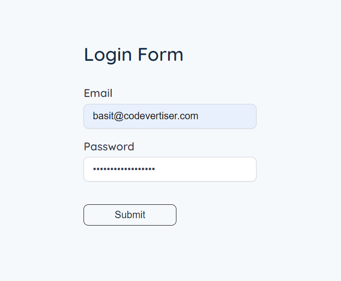
React Input UI without Error
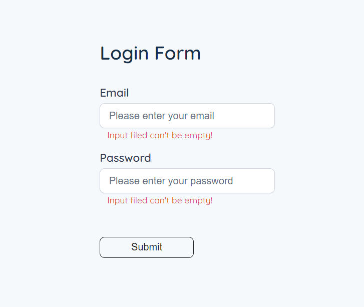
React Input UI with Error
Reusable Input Component Architecture
Let's talk about component architecture.
The input component has multiple props. It depends on your choice that what you want to keep and remove as required. The following are the possible props:
-
type: Specifies the type of input (e.g.,'text','number','email','password'). -
label: The text for the input label. -
value: The current value of the input. -
error: An error message to display which is optional and shown on the basis of condition. -
name: Represents the name attribute of the input element to identify and group the data submitted from different input fields -
placeholder: The placeholder text to display when the input is empty. -
onChange: The function to handle changes in the input value. It takes an event of typeChangeEvent<HTMLInputElement>as a parameter. -
disabled: which is optional (indicated by the?symbol). It specifies whether the input should be disabled or not
JSX for React Input Component with label and error
1import { ChangeEvent, FC } from 'react'
2
3interface InputProps {
4  type: 'text' | 'number' | 'email' | 'password'
5  label: string
6  value: string | number
7  name: string
8  placeholder: string
9  error: boolean
10  disabled?: boolean
11  onChange: (e: ChangeEvent<HTMLInputElement>) => void
12}
13
14const Input: FC<InputProps> = ({
15  type,
16  label,
17  value,
18  name,
19  placeholder,
20  error,
21  disabled,
22  onChange,
23}) => {
24  return (
25    <div className="input-wrapper">
26      <label htmlFor={label}>{label}</label>
27      <input
28        type={type}
29        id={label}
30        value={value}
31        name={name}
32        placeholder={placeholder}
33        onChange={onChange}
34        disabled={disabled}
35      />
36      {error && <p className="error">Input filed can't be empty!</p>}
37    </div>
38  )
39}
40
41export default Input
CSS for Reusable Input Component
1.input-wrapper {
2  margin-top: 20px;
3}
4
5/* Input style */
6
7/* Label */
8label {
9  font-weight: 600;
10  font-size: 18px;
11  color: #344054;
12  display: block;
13  margin-bottom: 8px;
14}
15
16/* Input field */
17input {
18  font-size: 16px;
19  font-weight: 400;
20  width: 250px;
21  color: #344054;
22  background: #ffffff;
23  border: 1px solid #d0d5dd;
24  box-shadow: 0px 1px 2px rgba(16, 24, 40, 0.05);
25  border-radius: 8px;
26  padding: 10px 14px;
27}
28
29input::placeholder {
30  font-size: 16px;
31  font-weight: 400;
32  color: #667085;
33}
34
35/* Input field focus */
36input:focus {
37}
38
39.error {
40  color: #db4437;
41  font-size: 14px;
42  font-weight: 400;
43  margin-left: 12px;
44  margin-top: 4px;
45}
This is how our input component UI will look like if we will render it in App or parent component
We are done with component structure, architecture, and UI, now let's make it functional and see how we can use it in real world applications.
How to use Input Component with form
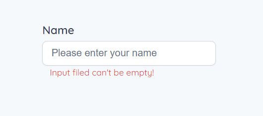
Let's say we are working on a login form in React App and want to use this input component there. In the below-given component, we import the Input component first and make two states, one for input value and the other for error.
While submitting the form, we check for an error and then show the error.
1import React, { ChangeEvent, FormEvent, useState } from 'react'
2import './App.css'
3import Input from './components/Input'
4
5const App: React.FC = () => {
6  const [name, setName] = useState('')
7  const [error, setError] = useState(false)
8
9  const handleNameChange = (e: ChangeEvent<HTMLInputElement>) => {
10    setName(e.target.value)
11  }
12
13  const handleSubmit = (e: FormEvent<HTMLFormElement>) => {
14    e.preventDefault()
15    if (!name.trim()) {
16      setError(true)
17    } else {
18      setError(false)
19    }
20  }
21
22  return (
23    <div className="page-center">
24      <form onSubmit={handleSubmit}>
25        <h3 className="form-title">Login Form</h3>
26        <Input
27          type="text"
28          label="Name"
29          value={name}
30          name="name"
31          error={error}
32          onChange={handleNameChange}
33          placeholder="Please enter your name"
34        />
35        <button type="submit">Submit</button>
36      </form>
37    </div>
38  )
39}
40
41export default App
Note
This is the boilerplate code you can tweak it as per your need.
Best Practices for Creating Reusable Input Components in React
You can get most out of reusable input components with some best practices. You must consider these while working on forms or input in React APP.
So, let’s see what are these practices:
1. Call handleSubmit function in form
Always wrap input inside form and call submit function in form tag and make the submit button type="submit", it will invoke submit function both ways, by pressing submit button and enter key on the keyboard.
2. When to disable Input in React
Input tag also supports disabled prop, when to use it? It depends on the app use case, some developers make the input and submit form button both disable while submitting data to database to prevent retyping in input until you get the response back from database.
You can also learn more about how to use the loading spinner button in React, which I have discussed in this article.
3. Using htmlFor attribute for activating input by clicking a label
We also need to improve the UX of input component. There are two ways to activate input.
- Click the input box
- Click the label
We also have to implement the second point to improve the UX of the component.
The label element is associated with the input using the htmlFor attribute, which matches the id of the input element. This helps in accessibility by associating the label with the correct input.
4. useInput custom hook
Using the custom useInput hook we can further improve input component by making it modular and scalable.
1import { ChangeEvent, useState } from 'react'
2
3const useInput = (initialValue: string) => {
4  const [value, setValue] = useState(initialValue)
5  const [error, setError] = useState(false)
6
7  const handleChange = (e: ChangeEvent<HTMLInputElement>) => {
8    setValue(e.target.value)
9  }
10
11  return {
12    value,
13    error,
14    onChange: handleChange,
15    setError,
16  }
17}
18
19export default useInput
How to use useInput hook in form;
1import React, { FormEvent } from 'react'
2import './App.css'
3import Input from './components/Input'
4import useInput from './hooks/useInput'
5
6const App: React.FC = () => {
7  const { value, error, onChange, setError } = useInput('')
8
9  const handleSubmit = (e: FormEvent<HTMLFormElement>) => {
10    e.preventDefault()
11    if (!value.trim()) {
12      setError(true)
13    } else {
14      setError(false)
15    }
16  }
17
18  return (
19    <div className="page-center">
20      <form onSubmit={handleSubmit}>
21        <Input
22          type="text"
23          label="Name"
24          name="name"
25          value={value}
26          error={error}
27          onChange={onChange}
28          placeholder="Please enter your name"
29        />
30        <button type="submit">Submit</button>
31      </form>
32    </div>
33  )
34}
35
36export default App
What if you want to use two inputs in the form and that is email and password? If this is the case I will refactor the code this way;
1import React, { FormEvent } from 'react'
2import './App.css'
3import Input from './components/Input'
4import useInput from './hooks/useInput'
5
6const App: React.FC = () => {
7 const emailInput = useInput('')
8 const passwordInput = useInput('')
9
10 const handleSubmit = (e: FormEvent) => {
11 e.preventDefault()
12 validateInput(emailInput)
13 validateInput(passwordInput)
14 console.log('email ==>', emailInput.value, 'password ==>', passwordInput.value)
15 }
16
17 const validateInput = (input: { value: string, setError: (value: boolean) => void }) => {
18 if (!input.value.trim()) {
19 input.setError(true)
20 } else {
21 input.setError(false)
22 }
23 }
24
25 return (
26 <div className="page-center">
27 <form onSubmit={handleSubmit}>
28 <h3 className="form-title">Login Form</h3>
29 <Input
30 type="email"
31 label="Email"
32 name="email"
33 placeholder="Please enter your email"
34 {...emailInput}
35 />
36 <Input
37 type="password"
38 label="Password"
39 name="password"
40 placeholder="Please enter your password"
41 {...passwordInput}
42 />
43 <button className="submit-btn">Submit</button>
44 </form>
45 </div>
46 )
47}
48
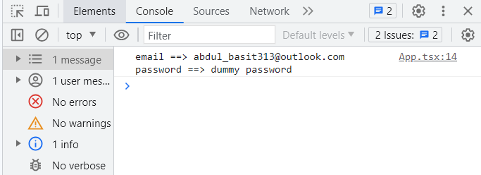
49export default AppWhile submitting the form we are checking if the input values are safely added to our state and verify the functionality of the useInput hook with console.log()
Further Read
If you have a form with more than one input, there is one more pattern useForm custom hook I teach in React forms best practices article.
If you are designing an input component with Tailwind CSS, copy the code from this doc: Input Component with Tailwind CSS.
Codepen Demo | Reusable Input Component
I hope you learned something new in this article that helps you in your React journey. Want to learn more about React? Do subscribe to the newsletter for more insightful content.
Written by
Abdul Basit
Frontend developer passionate about JavaScript, React, and building great web experiences. Writing about web development to help developers level up their skills.
Continue reading