


On This Page
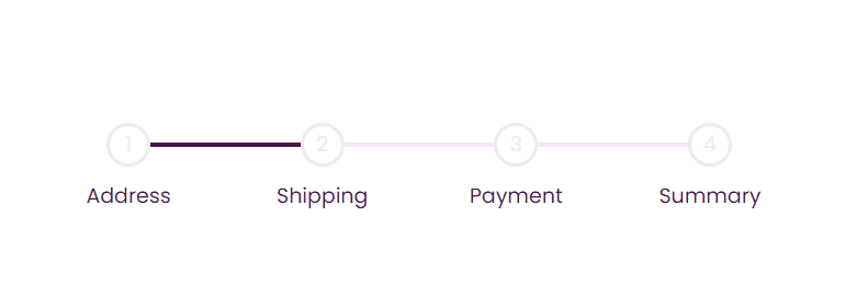
Demo App
This is what we are going to build in this tutorial. You can play with it.
Almost in every e-commerce app or website, we have a progress steps component. In most cases, we have to build customized progress step without using third-party UI libraries.
In this article, we will learn how to develop custom progress steps component with ReactJS and styled-components. You can use CSS or Tailwind instead of styled-components if you understand the trick.
Let’s Get Started
It needs to be coded in a way that it becomes reusable in any web app. The approach I use while building web apps is to design a UI first and then implement a logic.
First, let’s build the UI
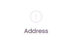
Step 01: Designing four steps
The step is just a circle. We can add a number or checkmark based on the state of the app, step will have a label too.
import React from 'react'import styled from 'styled-components'const StepWrapper = styled.div`position: relative;z-index: 1;`const StepStyle = styled.div`width: 40px;height: 40px;border-radius: 50%;background-color: #ffffff;border: 3px solid #f3e7f3;transition: 0.4s ease;display: flex;justify-content: center;align-items: center;`const StepCount = styled.span`font-size: 19px;color: #f3e7f3;`const StepsLabelContainer = styled.div`position: absolute;top: 66px;left: 50%;transform: translate(-50%, -50%);`const StepLabel = styled.span`font-size: 19px;color: #4a154b;`const ProgressSteps = () => {return (<StepWrapper><StepStyle><StepCount>1</StepCount></StepStyle><StepsLabelContainer><StepLabel>Address</StepLabel></StepsLabelContainer></StepWrapper>)}export default ProgressSteps
First Trick
You might have noticed we have made the position of step label absolute. It is to make it independent of the step circle (you will find the reason in step 2)
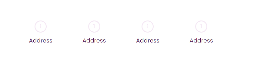
As we have four steps in our web app, so will map over them to build remaining steps.
import React from 'react'import styled from 'styled-components'const MainContainer = styled.div`width: 100%;max-width: 600px;margin: 0 auto;padding: 0 15px;`const StepContainer = styled.div`display: flex;justify-content: space-between;margin-top: 70px;position: relative;`const StepWrapper = styled.div`position: relative;z-index: 1;`const StepStyle = styled.div`width: 40px;height: 40px;border-radius: 50%;background-color: #ffffff;border: 3px solid #f3e7f3;transition: 0.4s ease;display: flex;justify-content: center;align-items: center;`const StepCount = styled.span`font-size: 19px;color: #f3e7f3;`const StepsLabelContainer = styled.div`position: absolute;top: 66px;left: 50%;transform: translate(-50%, -50%);`const StepLabel = styled.span`font-size: 19px;color: #4a154b;`const ProgressSteps = () => {return (<MainContainer><StepContainer>{[1, 2, 3, 4].map(() => (<StepWrapper><StepStyle><StepCount>1</StepCount></StepStyle><StepsLabelContainer><StepLabel>Address</StepLabel></StepsLabelContainer></StepWrapper>))}</StepContainer></MainContainer>)}export default ProgressSteps
Meanwhile, we have also added a StepContainer for making it display: flex and MainContainer to contain the whole component.
After doing it, we will have results something like this in our browser.
Making it dynamic
Is it the right approach? NO…
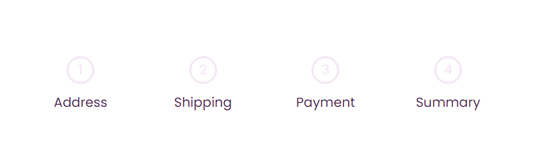
It is not the proper approach to build steps because what if a web app requires five or three steps? So, to make it completely dynamic and scalable, we will add a JavaScript array of objects.
const steps = [{label: 'Address',step: 1,},{label: 'Shipping',step: 2,},{label: 'Payment',step: 3,},{label: 'Summary',step: 4,},]const ProgressSteps = () => {return (<MainContainer><StepContainer>{steps.map(({ step, label }) => (<StepWrapper><StepStyle><StepCount>{step}</StepCount></StepStyle><StepsLabelContainer><StepLabel>{label}</StepLabel></StepsLabelContainer></StepWrapper>))}</StepContainer></MainContainer>)}
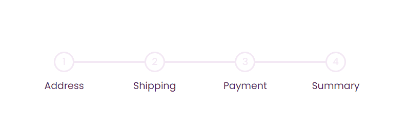
Step 02: Building a Progress Line
Next, we need a line over the steps to make it look connected. It is pretty simple; we will use CSS pseudo-class property for that. So, we don’t add another element to our DOM.
const StepContainer = styled.div`display: flex;justify-content: space-between;margin-top: 70px;position: relative;:before {content: '';position: absolute;background: #f3e7f3;height: 4px;width: 100%;top: 50%;transform: translateY(-50%);left: 0;}`
We have positioned the line in the middle of our container using the top, transform, and left properties and make it 100% of the container. This step has nothing fancy. Here we have only used simple CSS to get this result.
The last tricky step is here!
Right now, our progress line is dull and empty. We want to fill the portion of the line with a darker color whenever a step is done.
So, the trick here for having a color-filled progress line is adding another line using the CSS pseudo-element and positioning it over the previous one.
const StepContainer = styled.div`display: flex;justify-content: space-between;margin-top: 70px;position: relative;:before {content: '';position: absolute;background: #f3e7f3;height: 4px;width: 100%;top: 50%;transform: translateY(-50%);left: 0;}:after {content: '';position: absolute;background: #4a154b;height: 4px;width: 33%;top: 50%;transition: 0.4s ease;transform: translateY(-50%);left: 0;}`
Is it hard to understand? No, we are only playing with CSS properties.
Let me explain to you what we have done in this step. We have used the CSS pseudo-class after property for the darker progress line. It is set to static 33.3% width to see the result, but it will become dynamic after logic implementation.
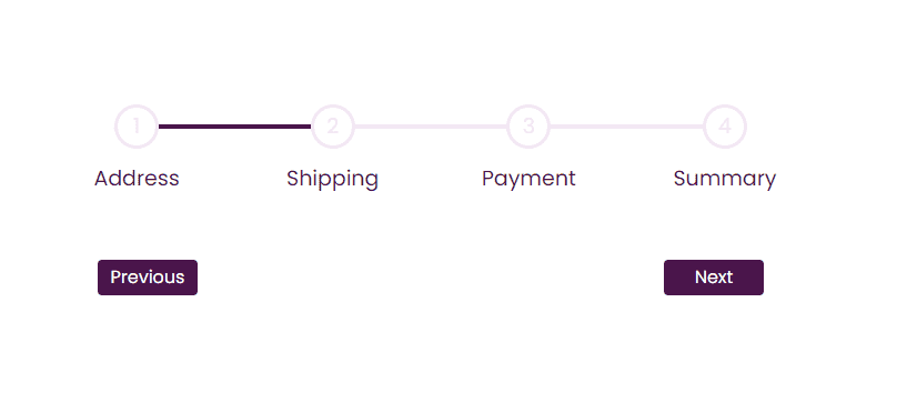
Step 03: Navigation Buttons
Now we are left with Next and Previous buttons. This part is quite straightforward
import React from 'react'import styled from 'styled-components'const MainContainer = styled.div`width: 100%;max-width: 600px;margin: 0 auto;padding: 0 15px;`const StepContainer = styled.div`display: flex;justify-content: space-between;margin-top: 70px;position: relative;:before {content: '';position: absolute;background: #f3e7f3;height: 4px;width: 100%;top: 50%;transform: translateY(-50%);left: 0;}:after {content: '';position: absolute;background: #4a154b;height: 4px;width: 33%;top: 50%;transition: 0.4s ease;transform: translateY(-50%);left: 0;}`const StepWrapper = styled.div`position: relative;z-index: 1;`const StepStyle = styled.div`width: 40px;height: 40px;border-radius: 50%;background-color: #ffffff;border: 3px solid #f3e7f3;transition: 0.4s ease;display: flex;justify-content: center;align-items: center;`const StepCount = styled.span`font-size: 19px;color: #f3e7f3;`const StepsLabelContainer = styled.div`position: absolute;top: 66px;left: 50%;transform: translate(-50%, -50%);`const StepLabel = styled.span`font-size: 19px;color: #4a154b;`const ButtonsContainer = styled.div`display: flex;justify-content: space-between;margin: 0 -15px;margin-top: 100px;`const ButtonStyle = styled.button`border-radius: 4px;border: 0;background: #4a154b;color: #ffffff;cursor: pointer;padding: 8px;width: 90px;:active {transform: scale(0.98);}:disabled {background: #f3e7f3;color: #000000;cursor: not-allowed;}`const steps = [{label: 'Address',step: 1,},{label: 'Shipping',step: 2,},{label: 'Payment',step: 3,},{label: 'Summary',step: 4,},]const ProgressSteps = () => {return (<MainContainer><StepContainer>{steps.map(({ step, label }) => (<StepWrapper><StepStyle><StepCount>{step}</StepCount></StepStyle><StepsLabelContainer><StepLabel>{label}</StepLabel></StepsLabelContainer></StepWrapper>))}</StepContainer><ButtonsContainer><ButtonStyle>Previous</ButtonStyle><ButtonStyle>Next</ButtonStyle></ButtonsContainer></MainContainer>)}export default ProgressSteps
Our button has active and disabled classes just like buttons have.
The first milestone is achieved, and we are done with our structural and CSS parts. It’s time to write some logic.
Second, let’s Make it Functional
To make the progress components fully functional, we have to implement two logics, the first to keep track of our actions and the second to calculate the width of the progress bar.
Let us start with the logic of keeping track of our actions.
We need only one state to keep track of our action steps. It requires two functions, one for the next and another for moving to the previous step.
const ProgressSteps = () => {const [activeStep, setActiveStep] = useState(1)const nextStep = () => {setActiveStep(activeStep + 1)}const prevStep = () => {setActiveStep(activeStep - 1)}const totalSteps = steps.lengthreturn (<MainContainer><StepContainer>{steps.map(({ step, label }) => (<StepWrapper><StepStyle><StepCount>{step}</StepCount></StepStyle><StepsLabelContainer><StepLabel>{label}</StepLabel></StepsLabelContainer></StepWrapper>))}</StepContainer><ButtonsContainer><ButtonStyle onClick={prevStep} disabled={activeStep === 1}>Previous</ButtonStyle><ButtonStyle onClick={nextStep} disabled={activeStep === totalSteps}>Next</ButtonStyle></ButtonsContainer></MainContainer>)}
We have added disabling button functionality with the logic: If activeState is 1 previous button will be disabled, and on the last step, the Next button will be disabled. We can change this logic while implementing it in a real-world app.
Now the last trick of this article is calculating the width
Our last trick or logic of this article is to calculate the width of the progress line.
Here is the formula:
const width = `${(100 / (totalSteps - 1)) * (activeStep - 1)}%`
If we increase or decrease steps, our progress line will not overflow or shorten than steps container because of this formula.
I learned this width calculation formula from Brad Traversy’s 50 Projects In 50 Days - HTML, CSS & JavaScript. Here you can find this course.
Dynamic width as props
const StepContainer = styled.div`display: flex;justify-content: space-between;margin-top: 70px;position: relative;:before {content: '';position: absolute;background: #f3e7f3;height: 4px;width: 100%;top: 50%;transform: translateY(-50%);left: 0;}:after {content: '';position: absolute;background: #4a154b;height: 4px;width: ${(props) => props.width};top: 50%;transition: 0.4s ease;transform: translateY(-50%);left: 0;}`const StepStyle = styled.div`width: 40px;height: 40px;border-radius: 50%;background-color: #ffffff;border: 3px solid${({ step }) => (step === 'completed' ? '#4A154B' : '#F3E7F3')};transition: 0.4s ease;display: flex;justify-content: center;align-items: center;`const CheckMark = styled.div`font-size: 26px;font-weight: 600;color: #4a154b;-ms-transform: scaleX(-1) rotate(-46deg); /* IE 9 */-webkit-transform: scaleX(-1) rotate(-46deg); /* Chrome, Safari, Opera */transform: scaleX(-1) rotate(-46deg);`<StepContainer width={width}>{steps.map(({ step, label }) => (<StepWrapper key={step}><StepStyle step={activeStep >= step ? 'completed' : 'incomplete'}>{activeStep > step ? <CheckMark>L</CheckMark> : <StepCount>{step}</StepCount>}</StepStyle><StepsLabelContainer><StepLabel key={step}>{label}</StepLabel></StepsLabelContainer></StepWrapper>))}</StepContainer>
We did three things in above code:
- Send width via props in
StepContainer, so it acts accordingly. - Darken the step border if the step is active or done. So, in
StepStyle, we will set the logic as ifacitveStepis equal to or greater than the step, it will passcompletedto props, otherwiseincomplete. - Insert a
checkmarkstyle, if the step is done, it will show the check mark inside the step; otherwise simple digit.
Finally, we are done with building reusable progress step component.
Complete Code
import React, { useState } from 'react'import styled from 'styled-components'const MainContainer = styled.div`width: 100%;max-width: 600px;margin: 0 auto;padding: 0 16px;`const StepContainer = styled.div`display: flex;justify-content: space-between;margin-top: 70px;position: relative;:before {content: '';position: absolute;background: #f3e7f3;height: 4px;width: 100%;top: 50%;transform: translateY(-50%);left: 0;}:after {content: '';position: absolute;background: #4a154b;height: 4px;width: ${({ width }) => width};top: 50%;transition: 0.4s ease;transform: translateY(-50%);left: 0;}`const StepWrapper = styled.div`position: relative;z-index: 1;`const StepStyle = styled.div`width: 40px;height: 40px;border-radius: 50%;background-color: #ffffff;border: 3px solid ${({ step }) =>step === 'completed' ? '#4A154B' : '#F3E7F3'};transition: 0.4s ease;display: flex;justify-content: center;align-items: center;`const StepCount = styled.span`font-size: 19px;color: #f3e7f3;@media (max-width: 600px) {font-size: 16px;}`const StepsLabelContainer = styled.div`position: absolute;top: 66px;left: 50%;transform: translate(-50%, -50%);`const StepLabel = styled.span`font-size: 19px;color: #4a154b;@media (max-width: 600px) {font-size: 16px;}`const ButtonsContainer = styled.div`display: flex;justify-content: space-between;margin: 0 -15px;margin-top: 100px;`const ButtonStyle = styled.button`border-radius: 4px;border: 0;background: #4a154b;color: #ffffff;cursor: pointer;padding: 8px;width: 90px;:active {transform: scale(0.98);}:disabled {background: #f3e7f3;color: #000000;cursor: not-allowed;}`const CheckMark = styled.div`font-size: 26px;font-weight: 600;color: #4a154b;-ms-transform: scaleX(-1) rotate(-46deg); /* IE 9 */-webkit-transform: scaleX(-1) rotate(-46deg); /* Chrome, Safari, Opera */transform: scaleX(-1) rotate(-46deg);`const steps = [{label: 'Address',step: 1,},{label: 'Shipping',step: 2,},{label: 'Payment',step: 3,},{label: 'Summary',step: 4,},]const ProgressSteps = () => {const [activeStep, setActiveStep] = useState(1)const nextStep = () => {setActiveStep(activeStep + 1)}const prevStep = () => {setActiveStep(activeStep - 1)}const totalSteps = steps.lengthconst width = `${(100 / (totalSteps - 1)) * (activeStep - 1)}%`return (<MainContainer><StepContainer width={width}>{steps.map(({ step, label }) => (<StepWrapper key={step}><StepStyle step={activeStep >= step ? 'completed' : 'incomplete'}>{activeStep > step ? (<CheckMark>L</CheckMark>) : (<StepCount>{step}</StepCount>)}</StepStyle><StepsLabelContainer><StepLabel key={step}>{label}</StepLabel></StepsLabelContainer></StepWrapper>))}</StepContainer><ButtonsContainer><ButtonStyle onClick={prevStep} disabled={activeStep === 1}>Previous</ButtonStyle><ButtonStyle onClick={nextStep} disabled={activeStep === totalSteps}>Next</ButtonStyle></ButtonsContainer></MainContainer>)}export default ProgressSteps