


On This Page
A stepper is needed for Multi-Step Processes, for example in ecommerce checkout or in any kind of form completion.
So its better to use pre build functional stepper component with react and tailwind, and save development time.
The good thing about tailwind is its really handy to add css properites, we don't have to move back and forth to css file.
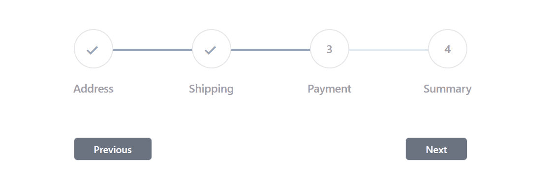
Here's what the stepper component looks like:
Tailwind CSS Stepper Component Code
import { useState } from 'react'interface Step {label: stringstep: number}interface StepperProps {steps: Step[]}const Stepper: React.FC<StepperProps> = ({ steps }) => {const [activeStep, setActiveStep] = useState(1)const nextStep = () => {setActiveStep((prevStep) => prevStep + 1)}const prevStep = () => {setActiveStep((prevStep) => prevStep - 1)}const totalSteps = steps.lengthconst width = `${(100 / (totalSteps - 1)) * (activeStep - 1)}%`return (<div className="w-full max-w-2xl mx-auto px-4 pb-10"><div className="flex justify-between mt-14 relative before:bg-slate-200 before:absolute before:h-1 before:top-1/2 before:transform-y-1/2 before:w-full before:left-0">{steps.map(({ step, label }) => (<div className="relative z-10" key={step}><divclassName={`size-16 rounded-full border-2 bg-white border-zinc-200 flex justify-center items-center transition-all ease-in delay-200 ${activeStep >= step ? 'border-slate-400' : ''}`}>{activeStep > step ? (<div className="text-2xl font-semibold text-slate-400 rotate-45 -scale-x-100">L</div>) : (<span className="text-lg text-zinc-400 font-medium">{step}</span>)}</div><div className="absolute top-24 left-1/2 -translate-y-2/4 -translate-x-2/4"><span className="text-lg text-zinc-400 font-semibold">{label}</span></div></div>))}<divclassName="absolute h-1 bg-slate-400 w-full top-1/2 transform-y-1/2 transition-all ease-in delay-200 left-0"style={{ width: width }}></div></div><div className="flex justify-between mt-28"><buttonclassName="border disabled:bg-gray-300 disabled:text-gray-700 disabled:cursor-not-allowed bg-gray-500 hover:bg-gray-600 text-white px-8 py-1.5 rounded-md font-medium text-base"onClick={prevStep}disabled={activeStep === 1}>Previous</button><buttonclassName="border disabled:bg-gray-300 disabled:text-gray-700 disabled:cursor-not-allowed bg-gray-500 hover:bg-gray-600 text-white px-8 py-1.5 rounded-md font-medium text-base"onClick={nextStep}disabled={activeStep === totalSteps}>Next</button></div></div>)}export default Stepper
Data Structure for Stepper Component
To use this stepper component, you need to pass data to it as props. It's helpful to keep this data separate, maybe in its own file, to keep the code organized.
export const steps = [{label: 'Address',step: 1,},{label: 'Shipping',step: 2,},{label: 'Payment',step: 3,},{label: 'Summary',step: 4,},]
How to use in Parent Component
And here's how you use it in a parent component
import Stepper from './components/Stepper'function App() {return (<><Stepper steps={steps} /></>)}export default App
If you find this helpful, let me know your thoughts and suggestions.
