


Whenever we want the user to insert some value in the application, we need a form element, and the input is the most essential part of the form. In this piece of content, you will find Tailwind CSS code for an input component with all the necessary props, including label and error.
We are tackling 7 props in this input component using TypeScript.
interface InputProps {type: 'text' | 'number' | 'email' | 'password'label?: stringvalue: string | numbername: stringplaceholder: stringerror?: stringdisabled?: booleanonChange: (e: ChangeEvent<HTMLInputElement>) => void}
We are also displaying the optional label and error.
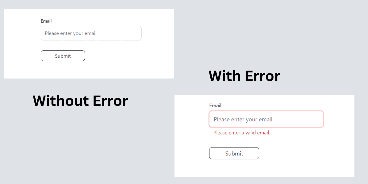
This is how the component looks with and without error:
Tailwind CSS Input Component Code
import { ChangeEvent, FC } from 'react'interface InputProps {type: 'text' | 'number' | 'email' | 'password'label?: stringvalue: string | numbername: stringplaceholder: stringerror?: stringdisabled?: booleanonChange: (e: ChangeEvent<HTMLInputElement>) => void}const Input: FC<InputProps> = ({type = 'text',label,value,name,placeholder,error,disabled,onChange,}) => {return (<div className="mb-4"><label htmlFor={label} className="block text-slate-700 font-medium text-sm mb-1.5">{label}</label><inputclassName={`border text-slate-700 border-gray-300 shadow-sm rounded-lg w-full py-2.5 px-3 placeholder-gray-500 text-base outline-blue-300 ${error && 'ring-2 ring-red-200'}`}type={type}id={label}value={value}name={name}placeholder={placeholder}onChange={onChange}disabled={disabled}/>{error && (<span role="alert" className="block text-red-600 text-sm ml-3 mt-1">{error}</span>)}</div>)}export default Input
How to use in parent Component
To test the component, we need to wrap input component inside a form element, which will have a submit button too.
Note
The input has a full width. We will adjust its width by putting it inside a wrapper. Below, I provide a form element with max-w-80, which is equivalent to 320px.
import { ChangeEvent, FormEvent, useState } from 'react'import Input from './components/input'function App() {const [email, setEmail] = useState<string>('')const [error, setError] = useState<string>('')const handleChange = (e: ChangeEvent<HTMLInputElement>): void => {setEmail(e.target.value)}const handleSubmit = (event: FormEvent<HTMLFormElement>): void => {event.preventDefault()if (!email) {setError('Please enter a valid email.')} else {console.log('email', email)setError('')// Handle form submission}}return (<><div className="max-w-6xl mx-auto px-3"><form onSubmit={handleSubmit} className="max-w-80 mt-10"><Inputtype="email"label="Email"name="email"placeholder="Please enter your email"value={email}onChange={handleChange}error={error}/><buttontype="submit"className="text-neutral-800 rounded-lg border border-neutral-800 bg-transparent px-2 py-1 min-w-[140px] mt-4 hover:bg-gray-200 hover:border-gray-400 ">Submit</button></form></div></>)}export default App
Further Reading
If you want to learn how to build this component step by step, read the React reusable input component tutorial.
Don't forget to let me know if it helps you.
