


You may have never seen a website without a footer, so let's add a Tailwind CSS footer component to our resource. It can be used on any website just by copying and pasting the code, hassle-free.
I have tried to cover all essential footer elements in this component. If something is left out, I will try to cover it in the next update with other variations.
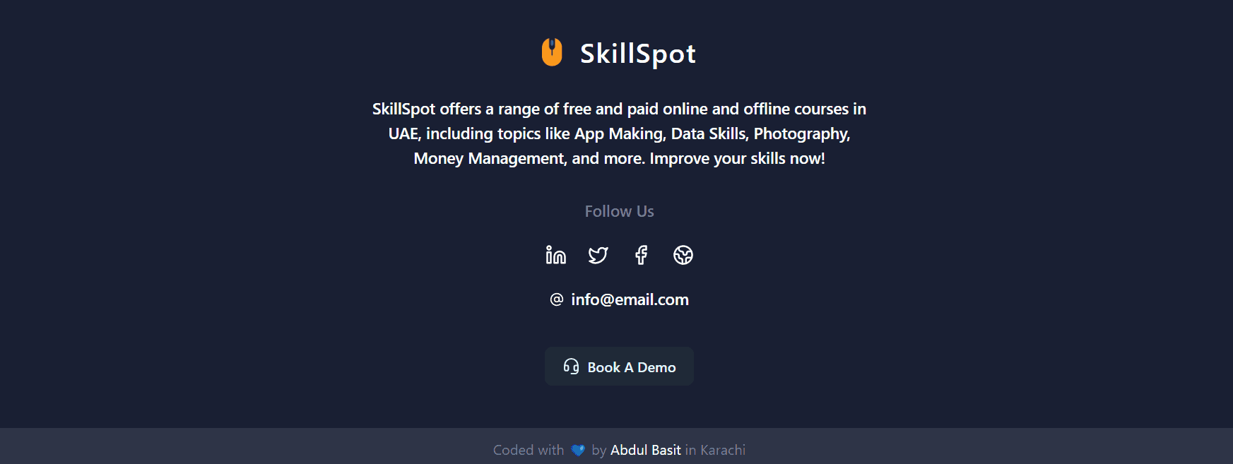
Our Tailwind footer component has the following essential elements:
- Logo: Show off your logo.
- Website Description: Say what your site is about.
- Social Links: Connect on social media.
- Contact Email: Let people reach out to you.
- Call to Action: Guide users to take action.
- Copyrights: Protect your content.
This Tailwind footer can be used as a template too, and you can customize it however you like!
Here's how the Footer Component UI looks:
Note
This footer component depends on the icon library luicide-react. You can download it using the command npm i lucide-react or use any icon library of your choice.
You can also choose from over 200k+ icons from IconBuddy. Save $80 by using the coupon code "CODEVERTISER" on the lifetime deal.
To make the code modular and scalable, I've created a variable for social links. In case of any changes, we only need to update the variable.
Additionally, I've separated the description to make it easier to modify.
Tailwind CSS Footer Code
import {AtSignIcon,EarthIcon,FacebookIcon,HeadsetIcon,LinkedinIcon,TwitterIcon,} from 'lucide-react'const socialLinks = [{name: 'LinkedIn',link: '/',icon: <LinkedinIcon />,},{name: 'X',link: '/',icon: <TwitterIcon />,},{name: 'Facebook',link: '/',icon: <FacebookIcon />,},{name: 'Website',link: '/',icon: <EarthIcon />,},]const description ='SkillSpot offers a range of free and paid online and offline courses in UAE, including topics like App Making, Data Skills, Photography, Money Management, and more. Improve your skills now!'const Footer = () => {return (<footer className="relative bg-[#191F33] z-50"><div className="px-4 py-12 flex flex-col items-center">{/* app logo */}<div><a href="/" className="flex justify-center items-center gap-5 mb-8 text-white"><imgsrc="https://res.cloudinary.com/dyvkdwzcj/image/upload/v1709055594/logo-1_vo1dni.png"className="h-8"alt="Logo"/><span className="font-semibold text-3xl tracking-wider">SkillSpot</span></a><p className="text-white max-w-xl text-center font-medium text-lg">{description}</p></div>{/* social links */}<div className="mt-8"><span className="text-[#767E94] block text-center mb-6 font-medium text-lg">Follow Us</span><ul className="flex gap-6 items-center">{socialLinks.map(({ name, icon, link }) => (<li key={name}><ahref={link}title={name}className="text-white hover:text-[#767e94]"target="_blank">{icon}</a><span className="sr-only">{name} account</span></li>))}</ul></div>{/* email */}<div className="text-white mt-6 mb-2 flex gap-2 items-center"><AtSignIcon size={16} /></div>{/* call to action */}<div className="mt-8"><buttontype="button"className="py-2.5 px-5 text-base font-semibold bg-gray-800 text-sky-100 rounded-lg hover:bg-gray-100 hover:text-sky-600 flex gap-2 items-center transition duration-300 ease-in-out"><HeadsetIcon size={20} /><span>Book A Demo</span></button></div></div>{/* about author or app/copyrights */}<div className="bg-[#2E3447]"><div className="text-center px-3 py-3"><span className="text-[#767E94]">Coded with 💙 by{' '}<ahref="https://www.linkedin.com/in/abdulbasitprofile/"target="_blank"className="text-white">Abdul Basit{' '}</a>in Karachi</span></div></div></footer>)}export default Footer
Feel free to adjust the style and use the code in your app.
If this code helps you in your project, or if you need more components, please let me know via LinkedIn.
