


The very first and one of the most important UI elements of any web application is the navbar. We have to design and code it carefully, we should also take care of its responsiveness so that it looks good on all screen sizes.
The structure of a navbar depends on the website's purpose. For instance, a navbar designed for an agency or portfolio site will differ from one built for an ecommerce platform or a blogging application.
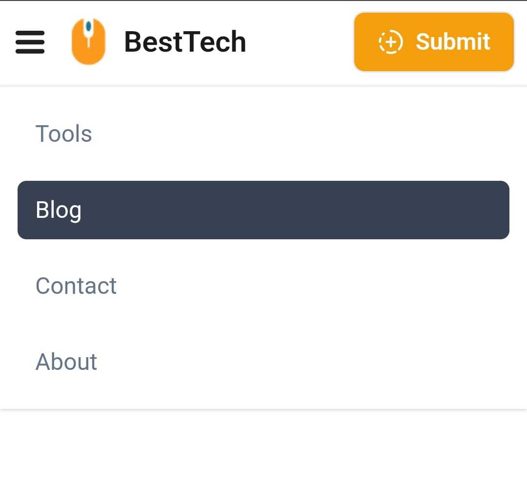
Navbar Structure
In this Navbar Component we have covered the three fundamental elements include:
- Logo
- Navigation Links
- Call-to-Action (CTA) Button
Navbar desktop UI

Navbar Mobile UI
On smaller screens, we animate the navigation elements by moving them from the top when the hamburger menu is clicked.
React Tailwind Navbar Component Code
import { CircleFadingPlus, MenuIcon } from 'lucide-react'import { useState } from 'react'const navLinks = [{ title: 'Tools', link: '#' },{ title: 'Blog', link: '#' },{ title: 'Contact', link: '#' },{ title: 'About', link: '#' },]const Navbar = () => {const [showNav, setShowNav] = useState(false)const handleShowNav = () => {setShowNav(!showNav)}return (<nav className="relative z-20 bg-white"><div className="mx-auto flex max-w-7xl items-center justify-between bg-white px-2 py-2 sm:px-6 lg:px-8"><div className="flex items-center gap-4 sm:gap-10">{/* hamburger menu */}<button onClick={handleShowNav} aria-label="Toggle Menu" className="md:hidden"><MenuIcon color="#202020" strokeWidth={3} size={25} /></button>{/* logo */}<a href="https://www.codevertiser.com/" className="flex items-center gap-3"><imgsrc="https://res.cloudinary.com/dyvkdwzcj/image/upload/v1709055594/logo-1_vo1dni.png"className="h-8"alt="Logo"/><span className="self-center whitespace-nowrap text-xl font-semibold text-stone-900 md:text-2xl">BestTech</span></a>{/* nav links */}<divclassName={`absolute left-0 right-0 -z-10 flex w-full flex-col gap-3 bg-white p-3 shadow transition-all duration-300 ease-in-out md:relative md:left-0 md:right-auto md:top-auto md:z-auto md:flex-row md:shadow-none ${showNav ? 'top-[60px]' : 'top-[-165px]'}`}>{navLinks.map(({ title, link }, index) => (<akey={index}href={link}className="rounded-md px-3 py-2 text-slate-500 transition-colors duration-100 ease-linear hover:bg-gray-700 hover:text-white">{title}</a>))}</div></div>{/* CTA button */}<div><buttontype="button"className="flex items-center gap-2 rounded-lg border bg-amber-500 px-4 py-2 text-base font-semibold text-white transition duration-300 ease-in-out hover:bg-amber-600 active:scale-95 sm:px-5 sm:py-2.5"><CircleFadingPlus size={18} /><span>Submit</span></button></div></div></nav>)}export default Navbar
In what type of web application this navbar can be used?
This navbar UI can be used for various types of web applications, including landing pages, blogs, agency or portfolio sites, ecommerce sites (with some tweaks), and directory sites.
Dependecies
For icons, I used the Lucide React npm module. However, feel free to use your preferred icon library if desired.
You can also choose from over 200k+ icons from IconBuddy. Save $80 by using the coupon code "CODEVERTISER" on the lifetime deal.
Further Reading
To learn how to build this responsive navbar component step by step in React, read the How to build Responsive Navbar in React tutorial.
Feel free to utilize and customize this navbar code snippet as per your preferences and business needs.
