


On This Page
In this article, you'll find the code for a Simple Hero section that you can use on your directory, info, or blog website. It's made with React and Tailwind CSS. Plus, you'll get versions for both light and dark modes.
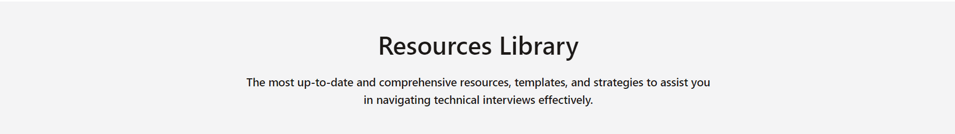
Hero Section Light Mode UI
Hero Section Light Mode Component Code
import React from 'react'interface HeroProps {title: stringdescription?: string}const Hero: React.FC<HeroProps> = ({ title, description }) => {return (<div className="bg-zinc-100"><div className="mx-auto max-w-3xl px-3 py-6 text-center md:py-11"><h1 className="text-3xl font-semibold leading-tight text-stone-900 md:text-[40px]">{title}</h1>{description && (<h2 className="mt-5 text-lg text-stone-900 md:font-medium">{description}</h2>)}</div></div>)}export default Hero
Hero Section Dark Mode UI

Hero Section Dark Mode Component Code
import React from 'react'interface HeroProps {title: stringdescription?: string}const Hero: React.FC<HeroProps> = ({ title, description }) => {return (<div className="bg-gray-900"><div className="mx-auto max-w-3xl px-3 py-6 text-center md:py-11"><h1 className="text-3xl font-semibold leading-tight text-white md:text-[40px]">{title}</h1>{description && (<h2 className="mt-5 text-lg text-gray-300 md:font-medium">{description}</h2>)}</div></div>)}export default Hero
Happy Coding!
