


On This Page
Graphs and charts offer the most visually appealing and effective ways of presenting data.
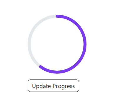
In this document, you'll get a Circular Progress Bar component made with React and Tailwind CSS. It's a visual and popular method to show data.
Circular Progress Bar UI
React Tailwind Circular Progress Bar Component Code
This component accepts 3 props:
strokeWidth: thickness of the bar stroke.sqSize: specifies the diameter of the circle.percentage: the progress percentage, determine how much to fill.
You can increase or decrease the number of props as per your need.
import { FC } from 'react'interface Props {strokeWidth?: numbersqSize?: numberpercentage: number}const CircularProgressBar: FC<Props> = (props) => {const { strokeWidth = 8, sqSize = 160, percentage } = propsconst radius = (sqSize - strokeWidth) / 2const viewBox = `0 0 ${sqSize} ${sqSize}`const dashArray = radius * Math.PI * 2const dashOffset = dashArray - (dashArray * (percentage || 0)) / 100return (<svg width={sqSize} height={sqSize} viewBox={viewBox}><circleclassName="fill-none stroke-gray-200"cx={sqSize / 2}cy={sqSize / 2}r={radius}strokeWidth={`${strokeWidth}px`}/><circleclassName="fill-none stroke-violet-600 transition-all ease-in delay-200"cx={sqSize / 2}cy={sqSize / 2}r={radius}strokeLinecap="round"strokeWidth={`${strokeWidth}px`}transform={`rotate(-90 ${sqSize / 2} ${sqSize / 2})`}style={{strokeDasharray: dashArray,strokeDashoffset: dashOffset,}}/></svg>)}export default CircularProgressBar
How To Use Circular Progress Bar Component
To test the component, I've created an onChangeProgress method, which will update the progress to 20% on each click.
import { useState } from 'react'import CircularProgressBar from './components/CircularProgressBar'function App() {const [progress, setProgress] = useState(0)const onChangeProgress = () => {setProgress((prev) => prev + 20)}return (<div className="mx-20 my-20"><CircularProgressBar sqSize={160} strokeWidth={8} percentage={progress} /><buttononClick={onChangeProgress}className="text-neutral-800 rounded-lg border border-neutral-800 bg-transparent px-2 py-1 min-w-[140px] mt-4 hover:bg-gray-200 hover:border-gray-200 ">Update Progress</button></div>)}export default App
I hope this helps you in your project. If it does, do let me know. Your feedback will motivate me to create more components.
