On This Page
As intermediate and senior UI developers, we often find ourselves repeating the same CSS UI patterns and layouts using flexbox and other CSS properties.
Tailwind CSS has gained popularity among developers for its utility classes that enable faster UI development.
Similarly, while working with styled components, I realized the need for a more efficient approach. Creating a new styled component every time for layout and positioning is time-consuming, and all I want is to create a reusable flex component for faster development that manages layout, positioning, and gap via props.
To address this issue, I created simple reusable Flex components using Styled Components for my React App. So I don't have to repeat myself by creating the same styled component and repeating the same patterns over and over again and focus on logic building.
In this article, I will share the reusable flex component I created for my production app, with some explanations and use cases.
I have also written an article on how I structured a React app with styled components, covering theming, global styles, adding fonts, and much more. Feel free to check it out.
Creating a Flex Component with Styled Components
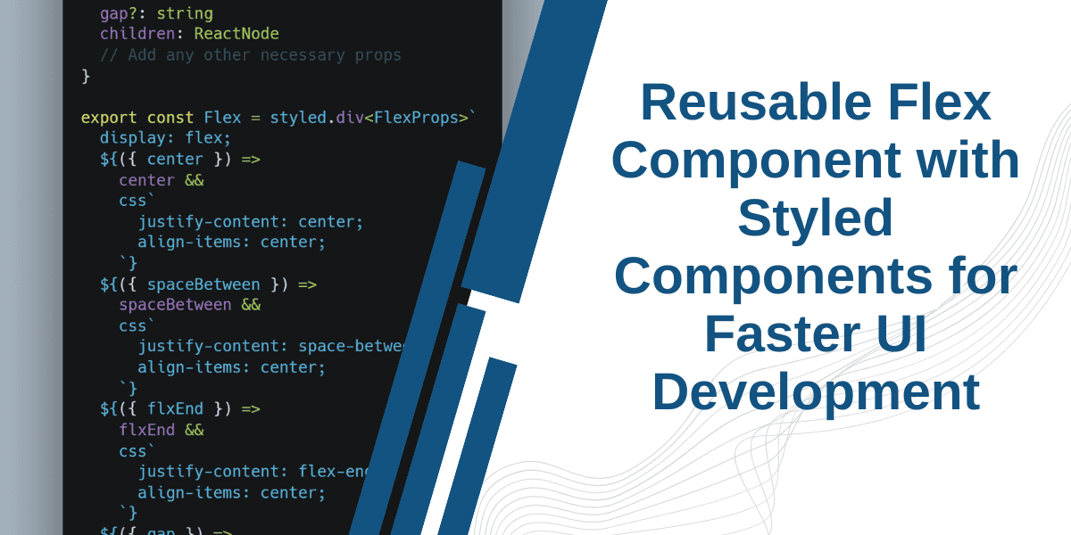
interface FlexProps {center?: booleanspaceBetween?: booleanflxEnd?: booleangap?: stringchildren: ReactNode// Add any other necessary props}export const Flex = styled.div<FlexProps>`display: flex;${({ center }) =>center &&css`justify-content: center;align-items: center;`}${({ spaceBetween }) =>spaceBetween &&css`justify-content: space-between;align-items: center;`}${({ flxEnd }) =>flxEnd &&css`justify-content: flex-end;align-items: center;`}${({ gap }) =>gap &&css`gap: ${gap};`}`
How to use Reusable Flex in Styled Components:
1. Positioning two or more elements side by side
To place two or more block elements side by side, simply wrap the block elements in the Flex component we created.
<Flex><div>Element 1</div><div>Element 2</div></Flex>
Similarly, to create space between elements, use the spaceBetween prop. To center the elements, use the center prop. In my case, I wanted one element at the end, so I used the flxEnd condition. This way, you can make the Flex styled component even more flexible.
2. Styled Components flex gap with a prop
To have dynamic gap spacing, I added a gap prop to our Flex component.
<Flex gap="10px"><div>Element 1</div><div>Element 2</div></Flex>
In one of my previous articles in the styled-components series, I discussed how to reuse styles in styled components, by giving some examples of reusable components and utility classes example. Make sure to give it a read!
You can modify and extend the Flex component further by adding more props.
I hope you found this article helpful and learned something new.
